CContemporary residential design in India’s technology capitals often treats brightness as synonymous with wellbeing, privileging natural light and neutral palettes while relegating darker interiors to the realm of decorative risk. Where the Light Lands proposes a more nuanced position: that shadow, handled with intent, can become the ground against which light gains greater presence.
Designed by TABA Design Studio for a couple working in Bangalore’s technology sector, the 1,200 sq ft residence is conceived as a sensory counterpoint to long days spent in the glow of screens. Architects Tantrima Basistha and Thanmayi V organise the home around a deliberate tonal shift: social spaces are enveloped in deep, matte black, while the private rooms transition into softer, sunlit calm. Rather than using darkness for drama alone, the studio employs it to slow the eye, heighten material texture and sharpen the experience of changing daylight. The result offers a compelling reconsideration of what a contemporary apartment within Bangalore’s high-rise landscape can feel like.
““By establishing a bold boundary of deep matte-black in the social zones, we anchored the home in a sense of absolute permanence, allowing the private bedrooms to feel profoundly bright, soft, and restful.””
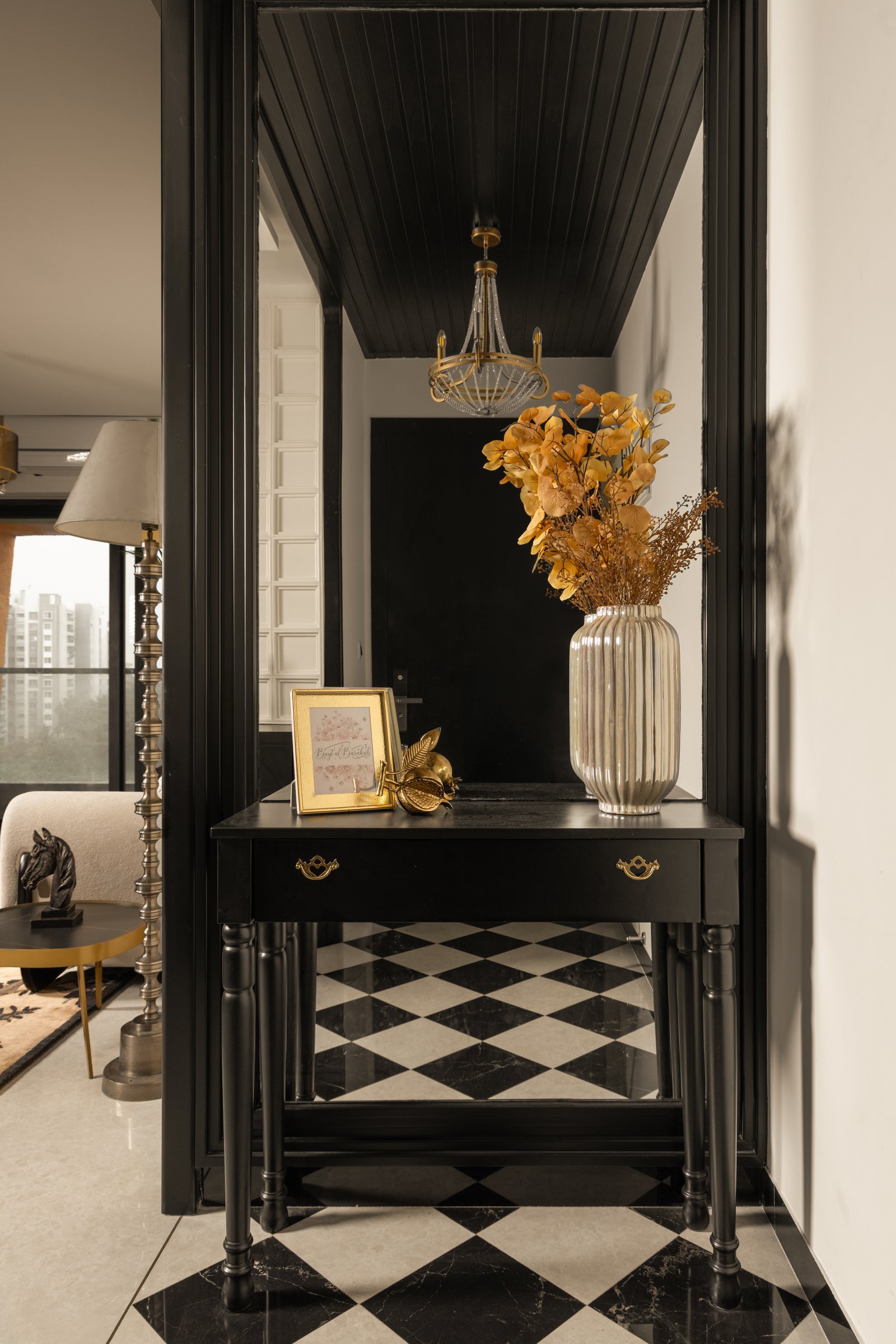
The journey begins at the foyer, where the pace of the city is deliberately slowed. A black-panelled console with carved legs and brass drawer pulls sits beneath a beaded chandelier, its warm light reflected across the lacquered surfaces around it. Underfoot, a black-and-cream diamond-patterned floor establishes a geometric rhythm that reappears more subtly throughout the apartment.
More than a threshold, the foyer operates as a moment of decompression. By narrowing the visual register to deep tones, reflective surfaces and a single ornamental light fixture, the architects allow the eye to adjust before the home opens into softer, brighter spaces. The transition makes arrival feel deliberate, separating the atmosphere of the apartment from the corridor and city beyond.
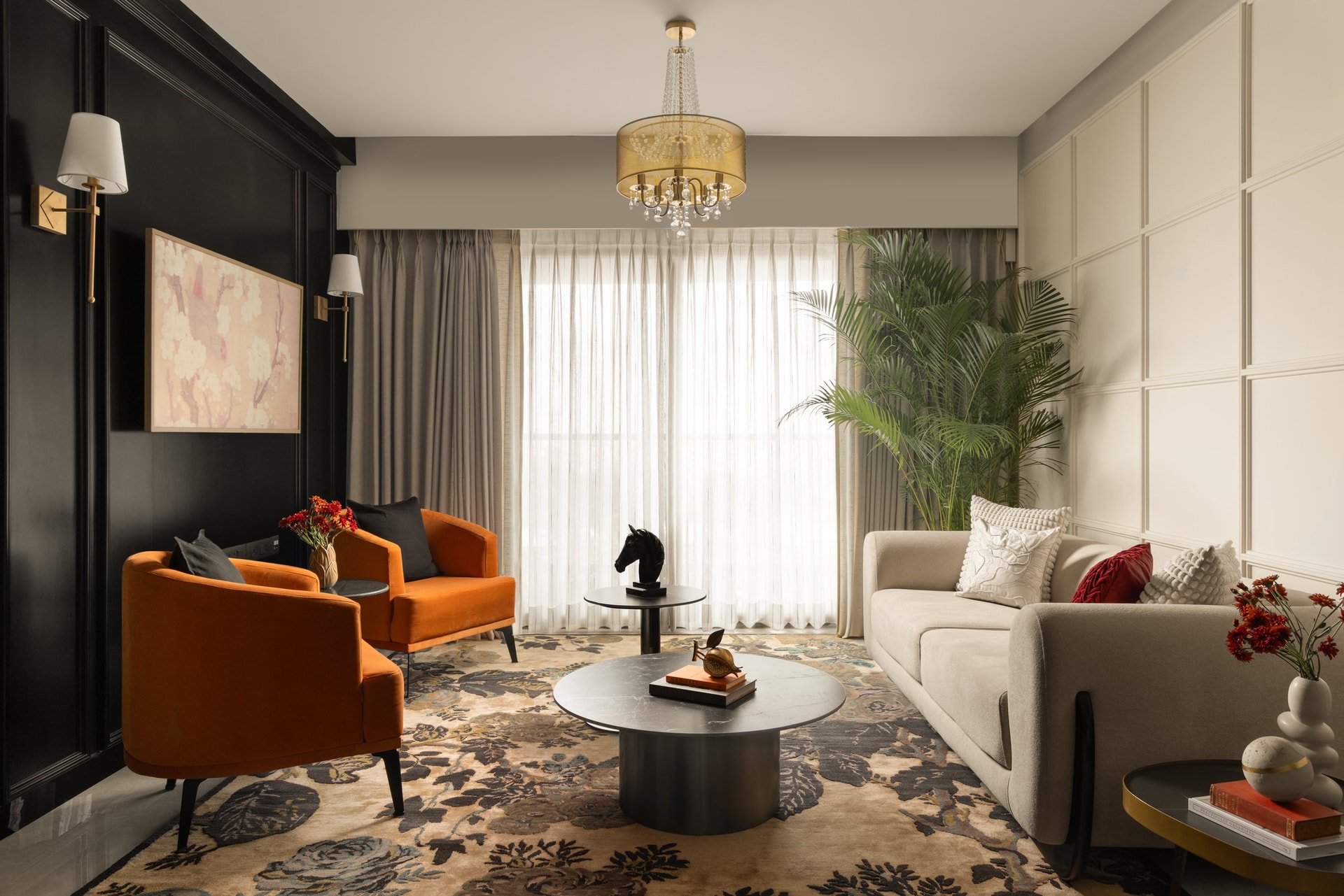
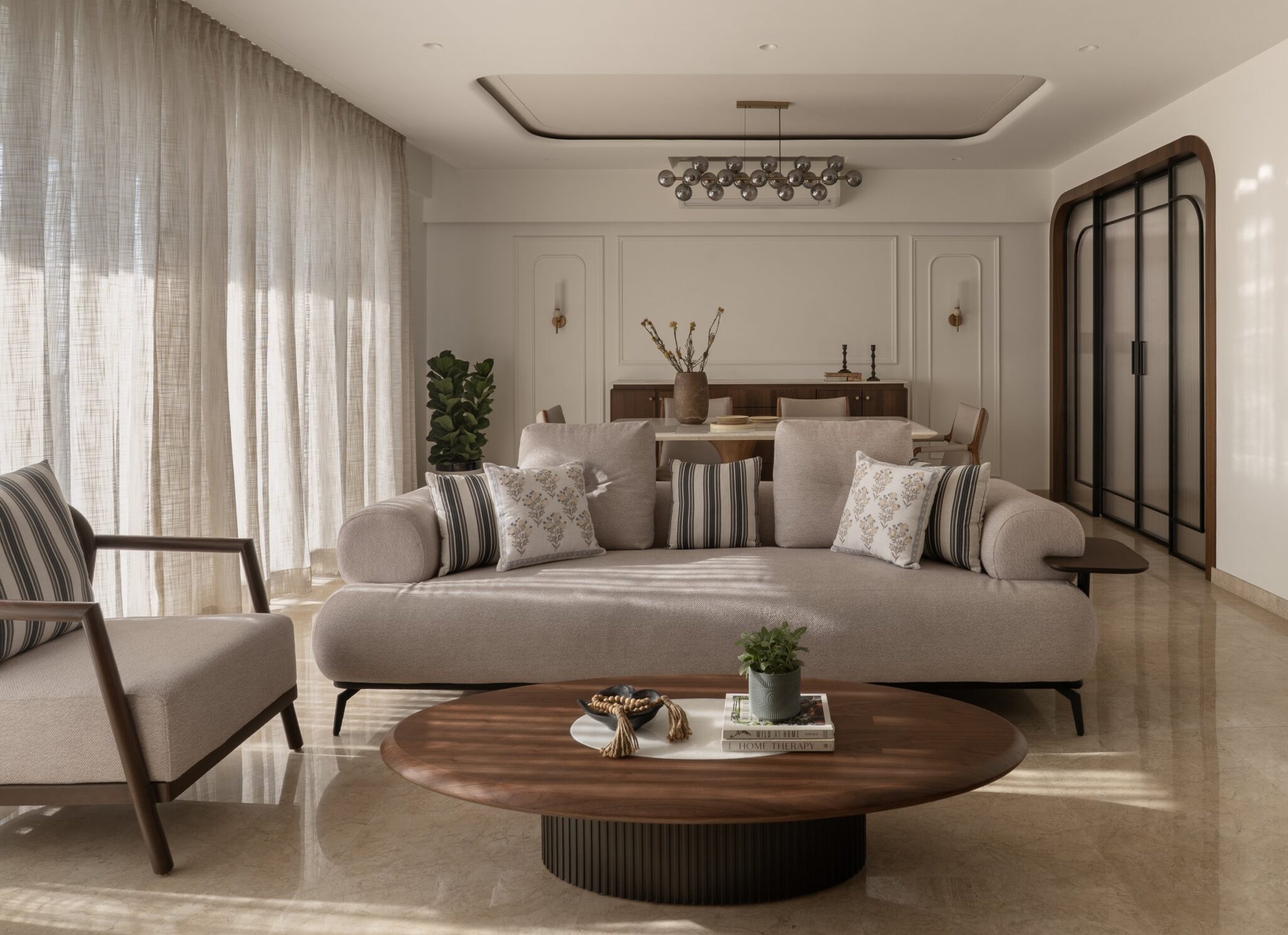
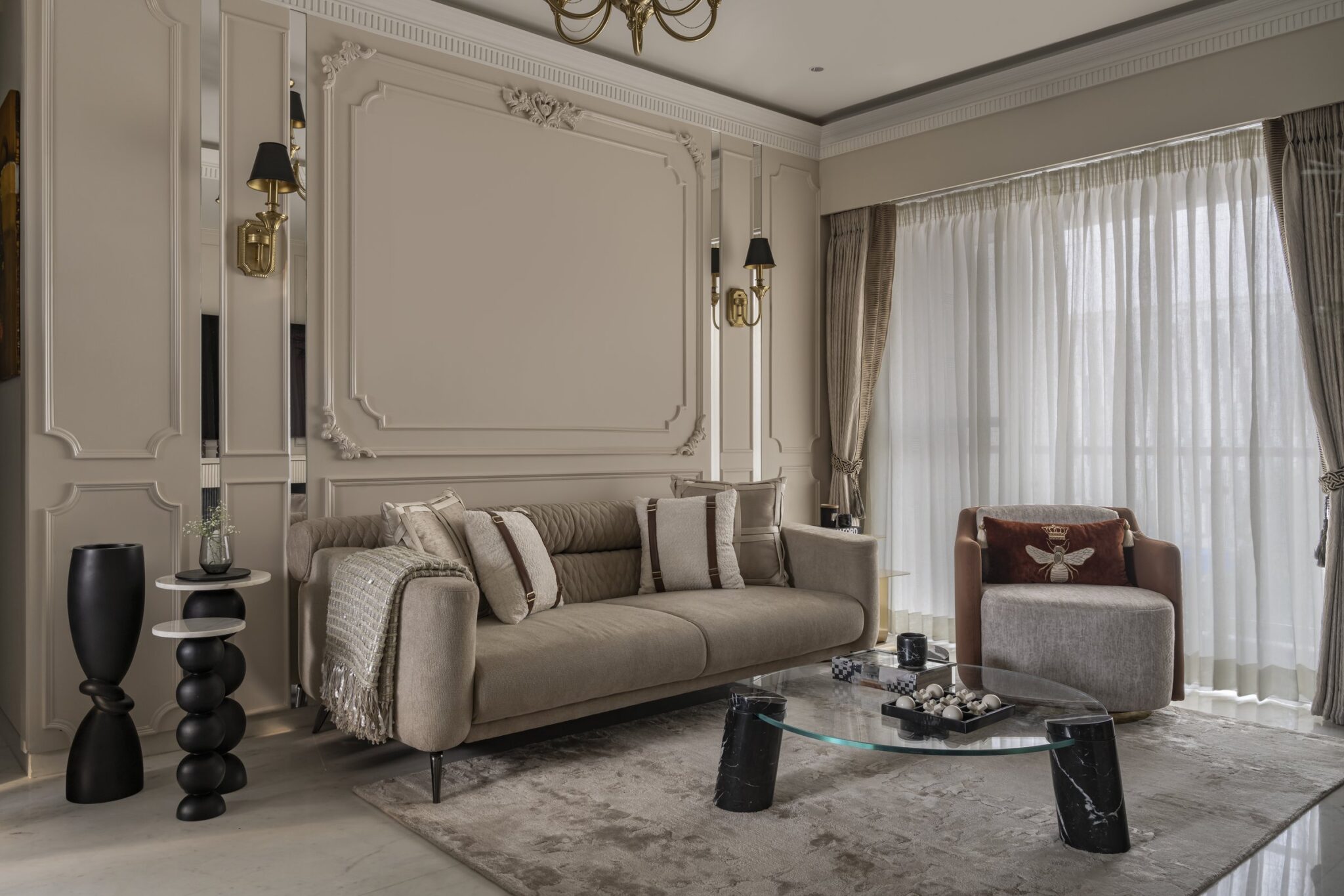
The living room carries this tonal language into a more social register. A panelled wall in deep matte black anchors one side of the room, framing an artwork between slender brass-and-white sconces. Opposite, a lighter grid of raised wall panels introduces relief and prevents the darker palette from becoming visually heavy. Between the two, a neutral upholstered sofa and a pair of burnt-orange velvet armchairs bring warmth and depth, their arrangement creating an easy sense of balance within the room.
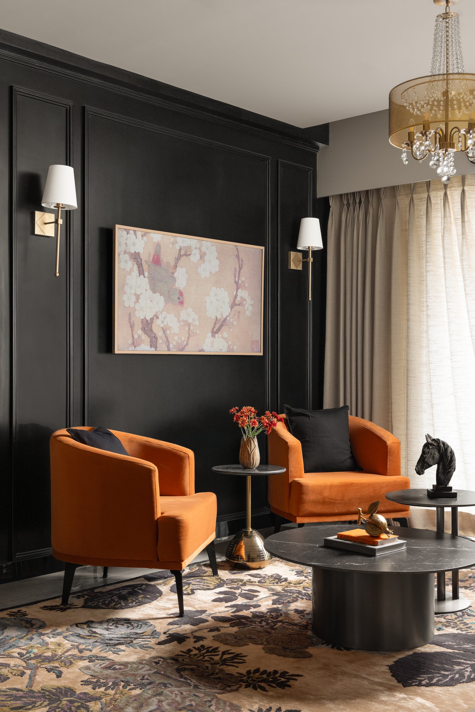
Seen closer, the dark-panelled wall reveals itself as the room’s compositional spine. The armchairs, upholstered in saturated rust velvet, punctuate the monochrome envelope with warmth rather than contrast for its own sake, while the crystal-and-brass chandelier overhead introduces a measured note of formality. Its decorative presence is carefully contained, adding refinement without tipping the room into period pastiche.
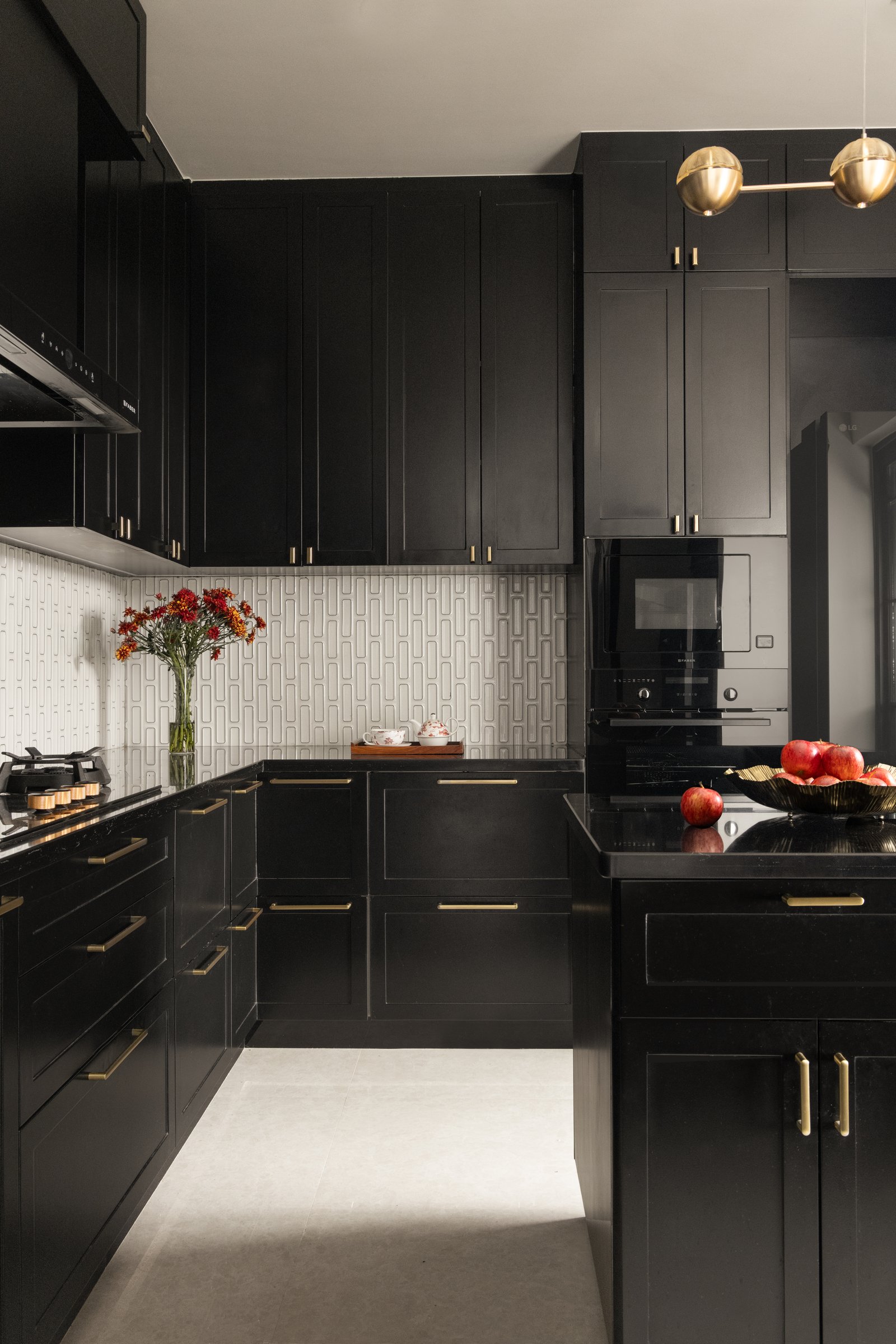
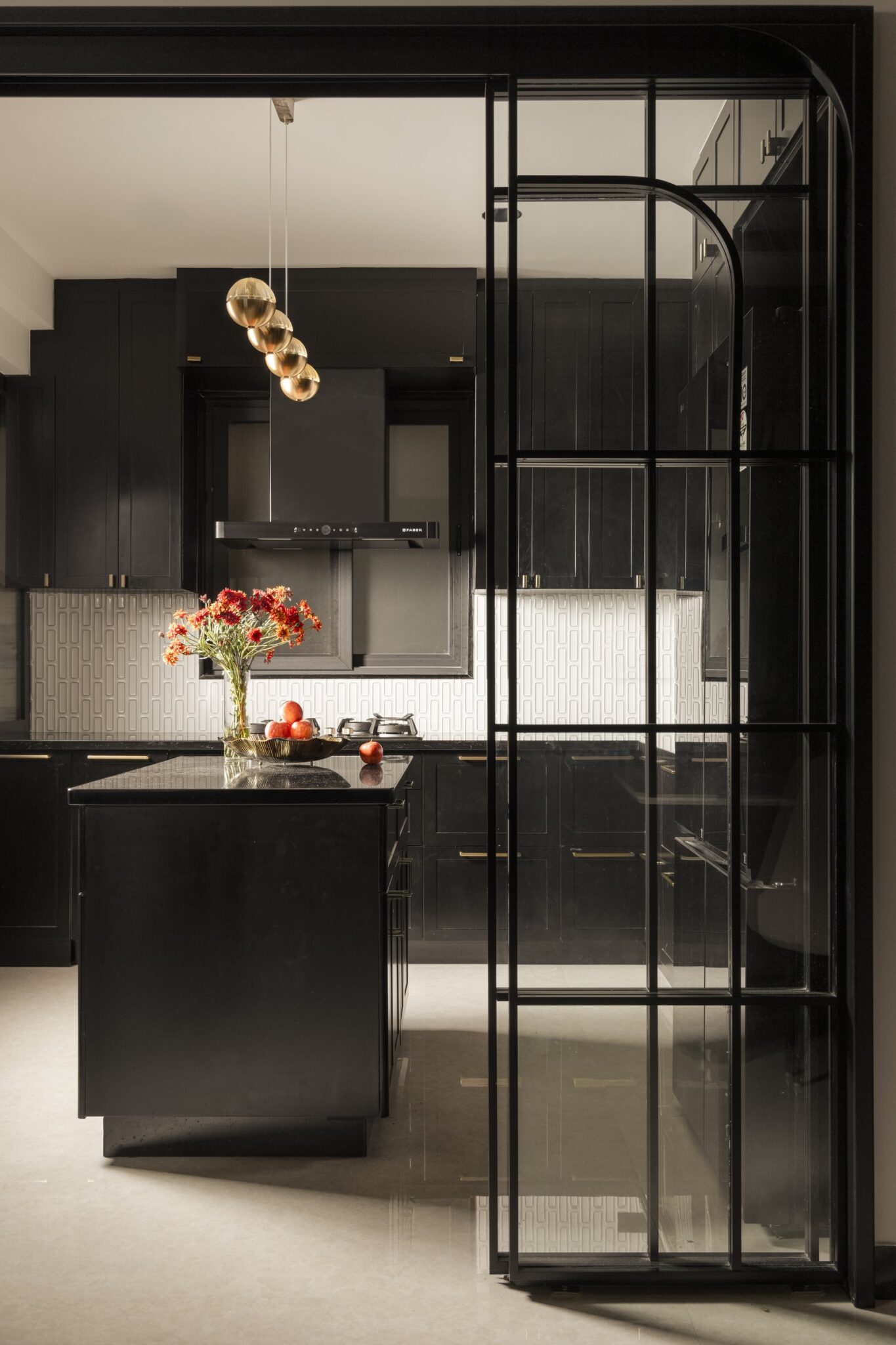
The kitchen commits fully to the home’s darker thesis. Matte-black Shaker-fronted cabinetry wraps the walls and island, punctuated by elongated brass pulls that provide a restrained decorative accent. Against this depth of tone, a white tiled backsplash laid in a stadium-shaped pattern introduces a crisp graphic rhythm, its raised geometry bringing texture and relief to the otherwise monochromatic composition.
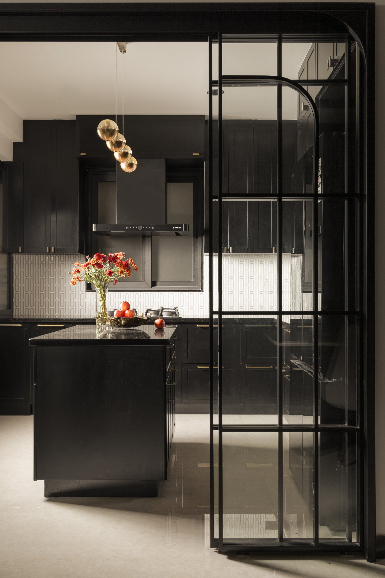
What lends the kitchen its spatial clarity is the arched steel-and-glass partition separating it from the dining area. Rather than closing the room off entirely, the framed glazing defines the threshold while preserving sightlines and allowing light to move between the two spaces. Above the island, a cluster of brass globe pendants introduces a warmer register, softening the otherwise disciplined palette without disrupting its restraint.
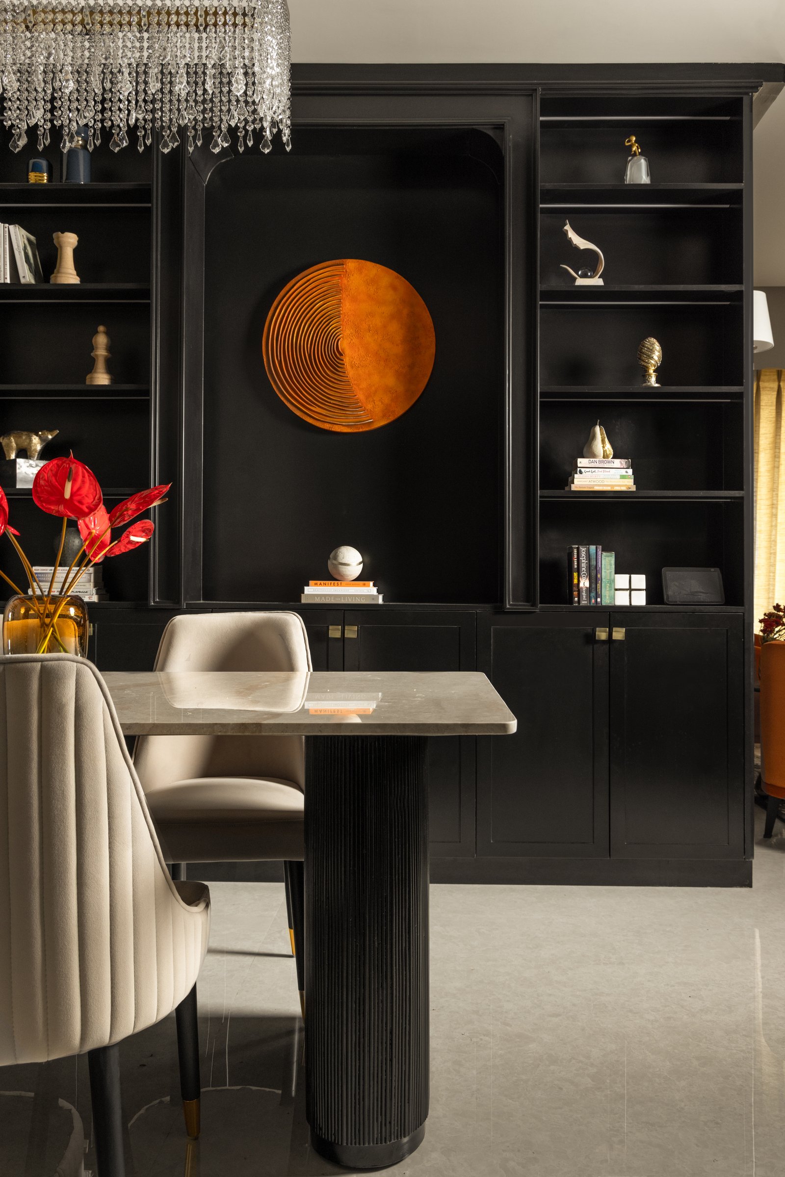
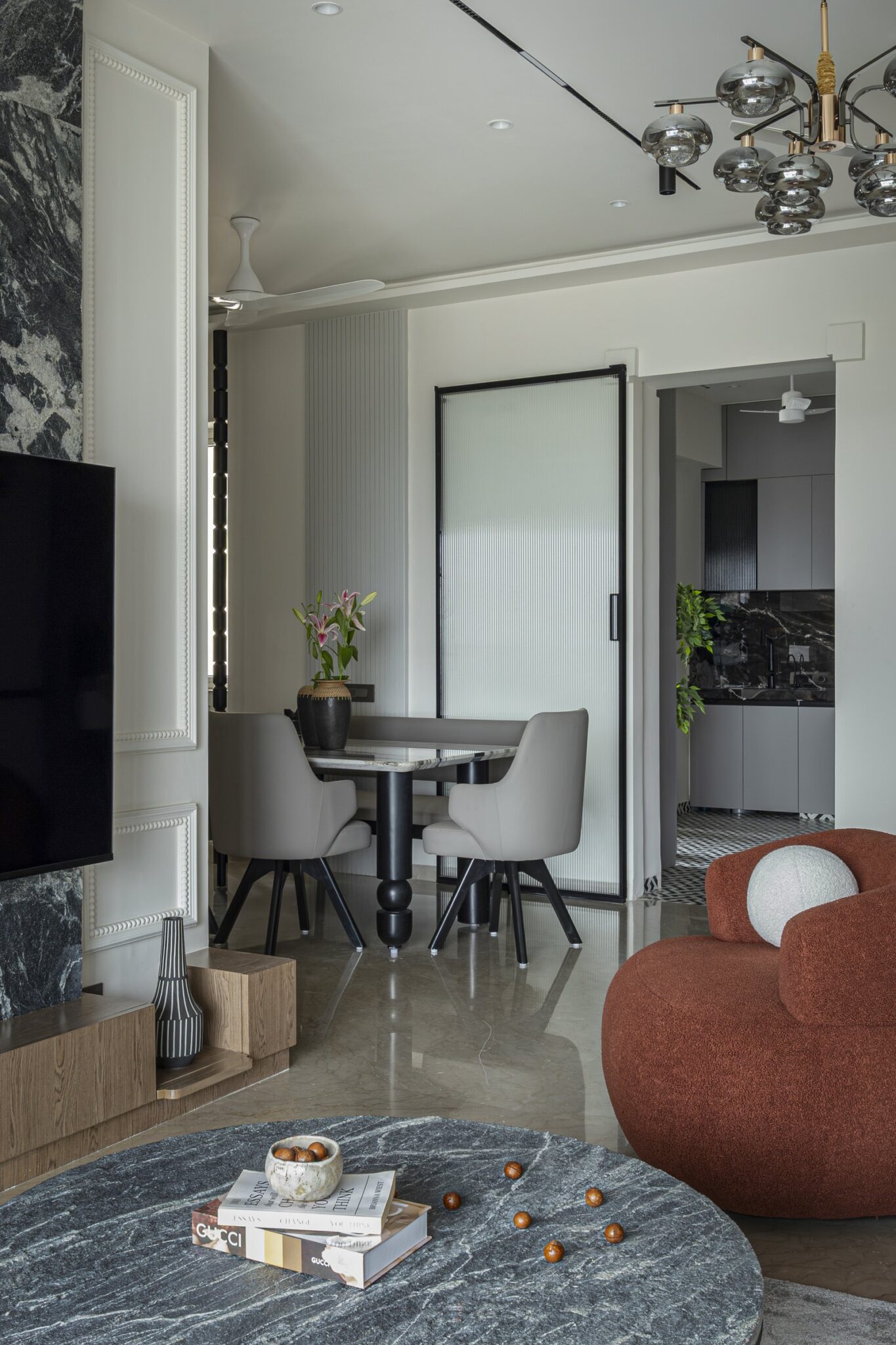
The dining area treats its shared wall with the kitchen as a composition of joinery rather than a conventional backdrop. A full-height black cabinet frames a circular abstract artwork in burnt-orange tones, while open shelves hold a restrained edit of books and objects that echo the warmer accents of the adjoining living room. In front, a stone-topped dining table set on a fluted black pedestal gives the arrangement a quieter visual weight, grounding the room within the home’s darker material language.
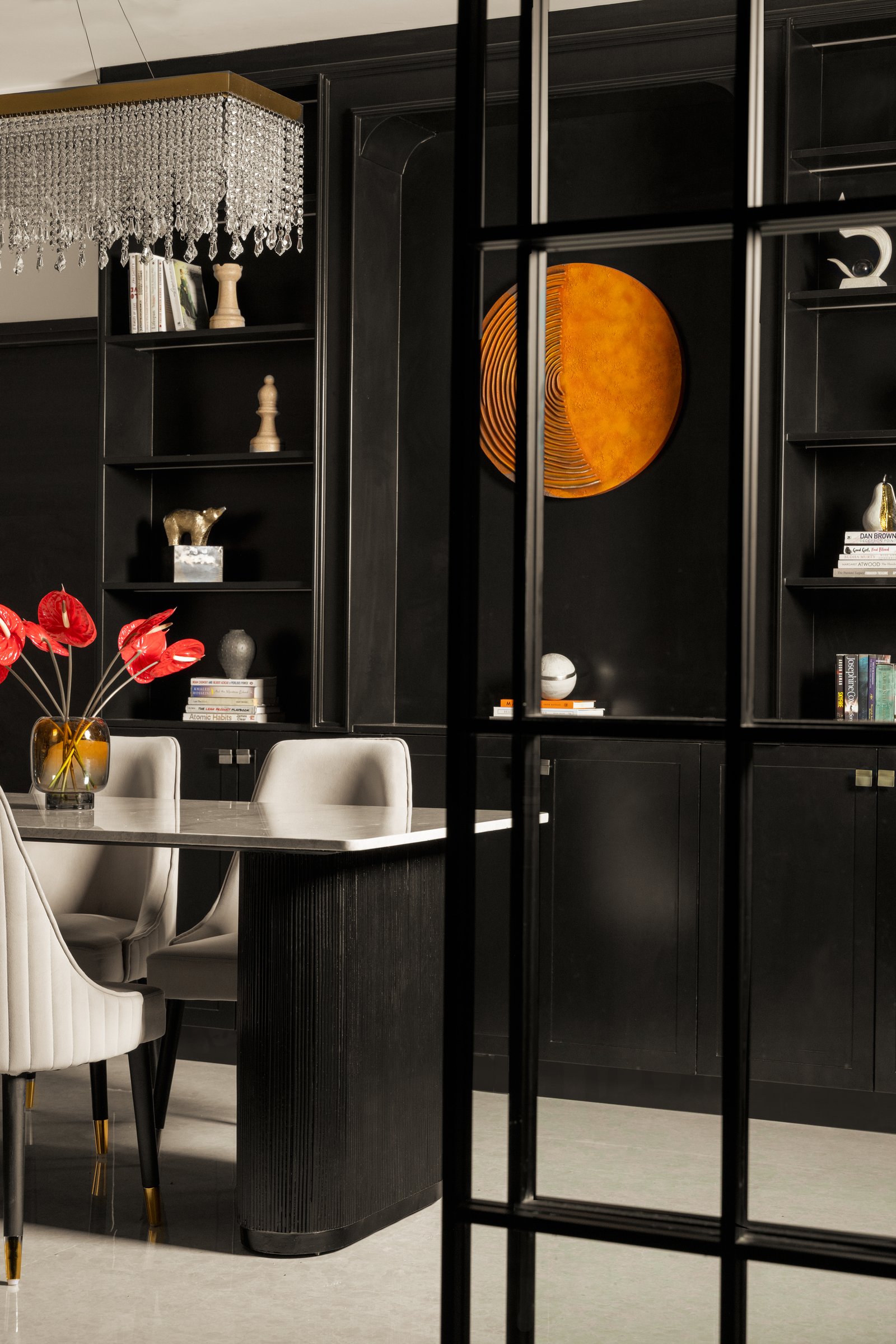
Viewed from the dining area, the arched partition becomes an architectural device that structures the wider social sequence, defining kitchen and dining without interrupting their visual connection. Dining chairs upholstered in a warm neutral fabric and finished with brass ferrules soften the surrounding darkness.
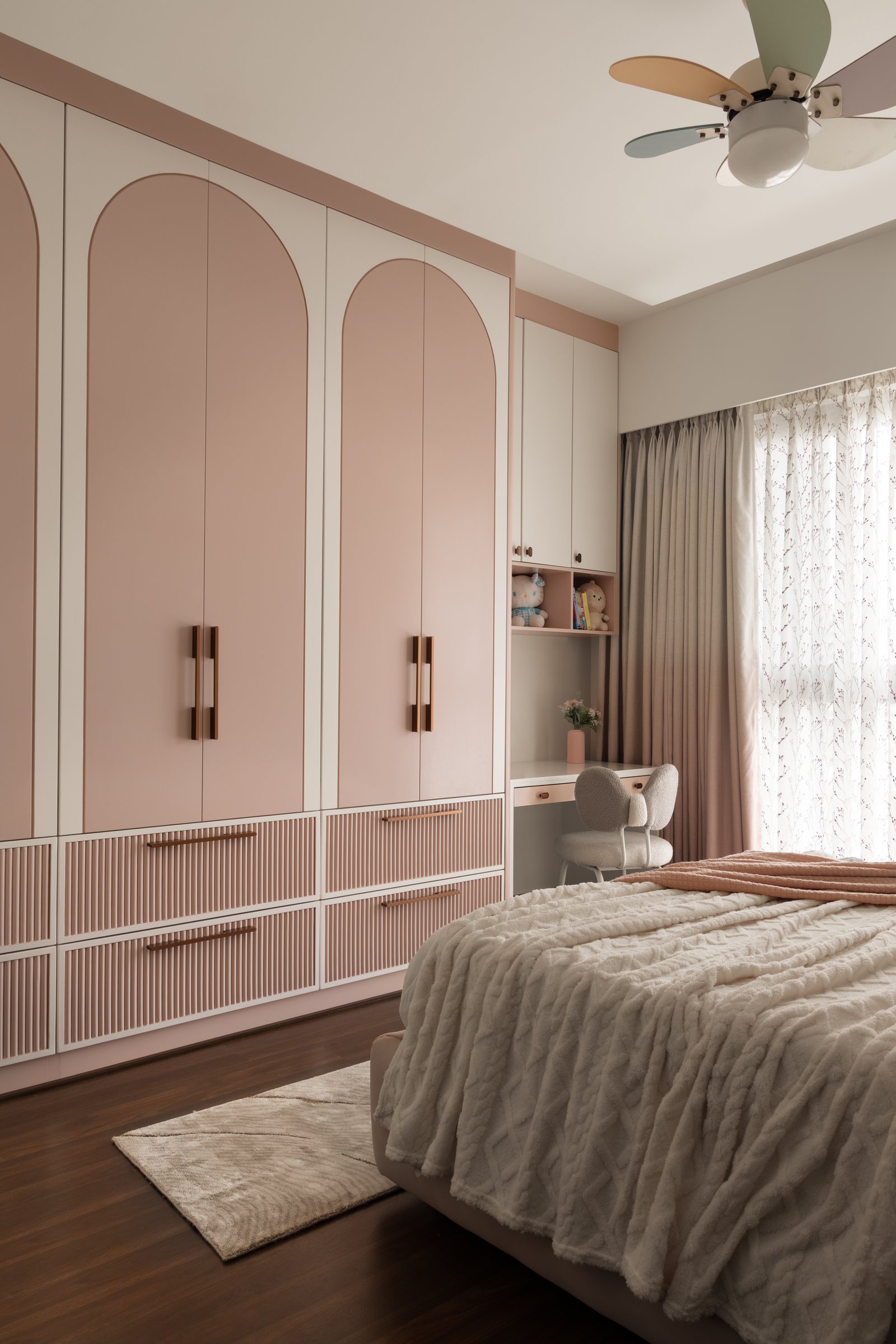
The daughters’ room marks the tonal shift anticipated by the home’s title. A full wall of built-in cabinetry in dusty rose and cream is articulated with an arched inlay motif, while ribbed drawer fronts introduce tactile relief at hand height. Beside the window, a compact study nook pairs a small desk with a bouclé chair, creating a workspace designed to remain useful as the children grow. The room is conceived not simply for childhood, but with the years ahead in mind.
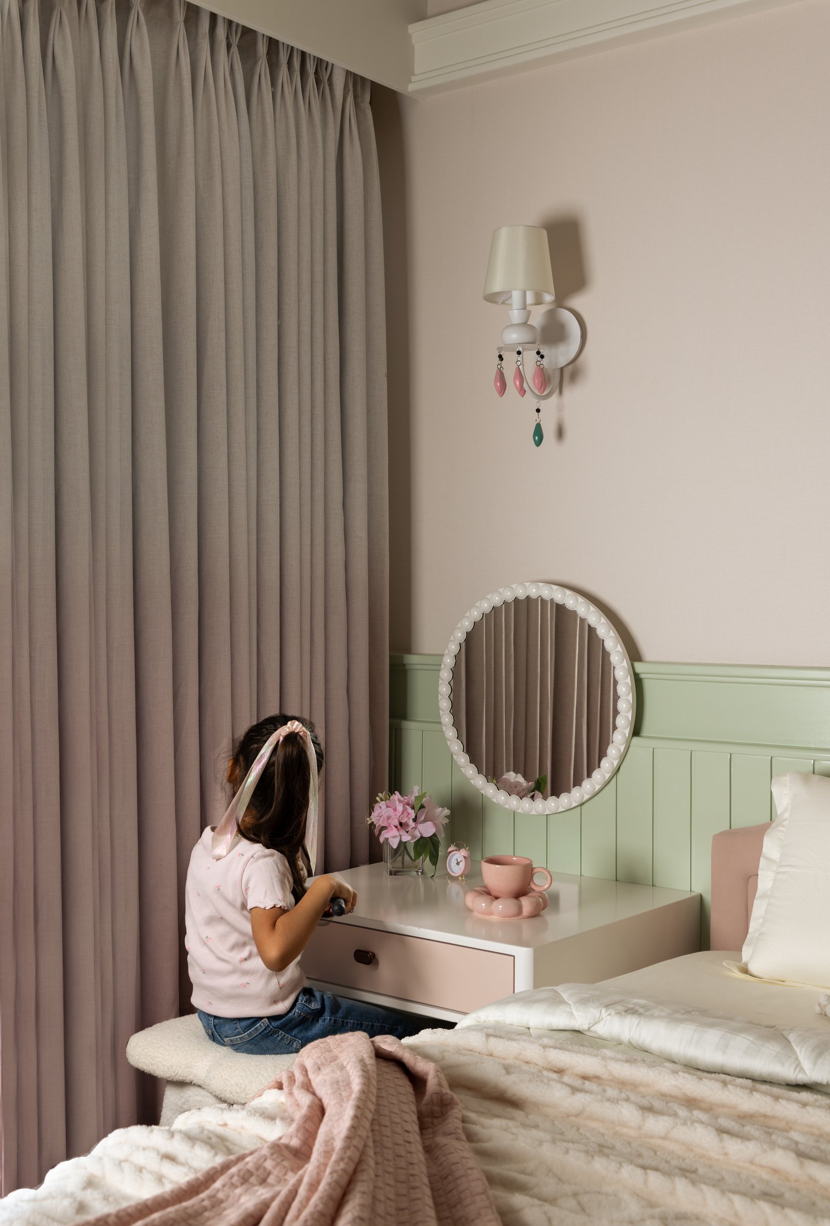
Opposite the wardrobe wall, sage-green vertical wainscoting rises beneath a soft blush wall, where a round beaded mirror hangs above a compact vanity ledge. The pairing of dusty rose and sage keeps the palette gentle without becoming overly sweet, striking a balance between playfulness and longevity that allows the room to evolve with its occupants.
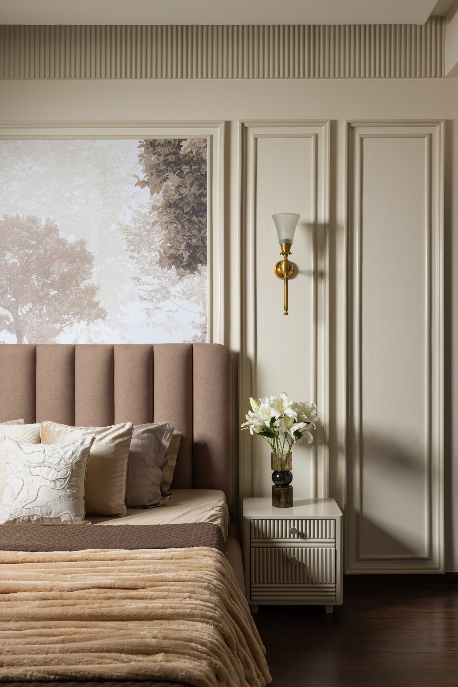
The master bedroom recedes into the apartment’s softest register. A tall, channel-tufted headboard in warm taupe is set against a misty forest mural, framed by cream wall panelling that extends onto the ceiling as a subtle fluted band. A slender brass sconce and fluted ivory nightstand complete the composition, creating a room that feels restorative rather than staged.
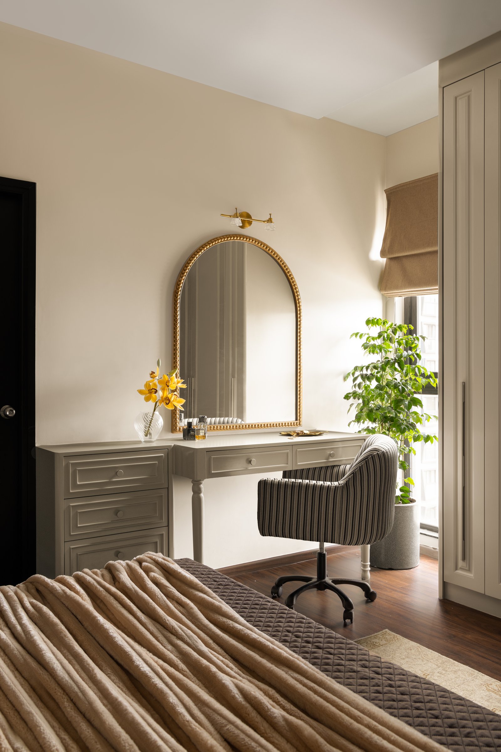
A compact dressing corner draws on natural light from the adjoining window. A gold-rimmed arched mirror hangs above a light grey vanity with turned legs and integrated drawers, while a striped upholstered chair introduces a subtle graphic note against the room’s otherwise hushed palette.
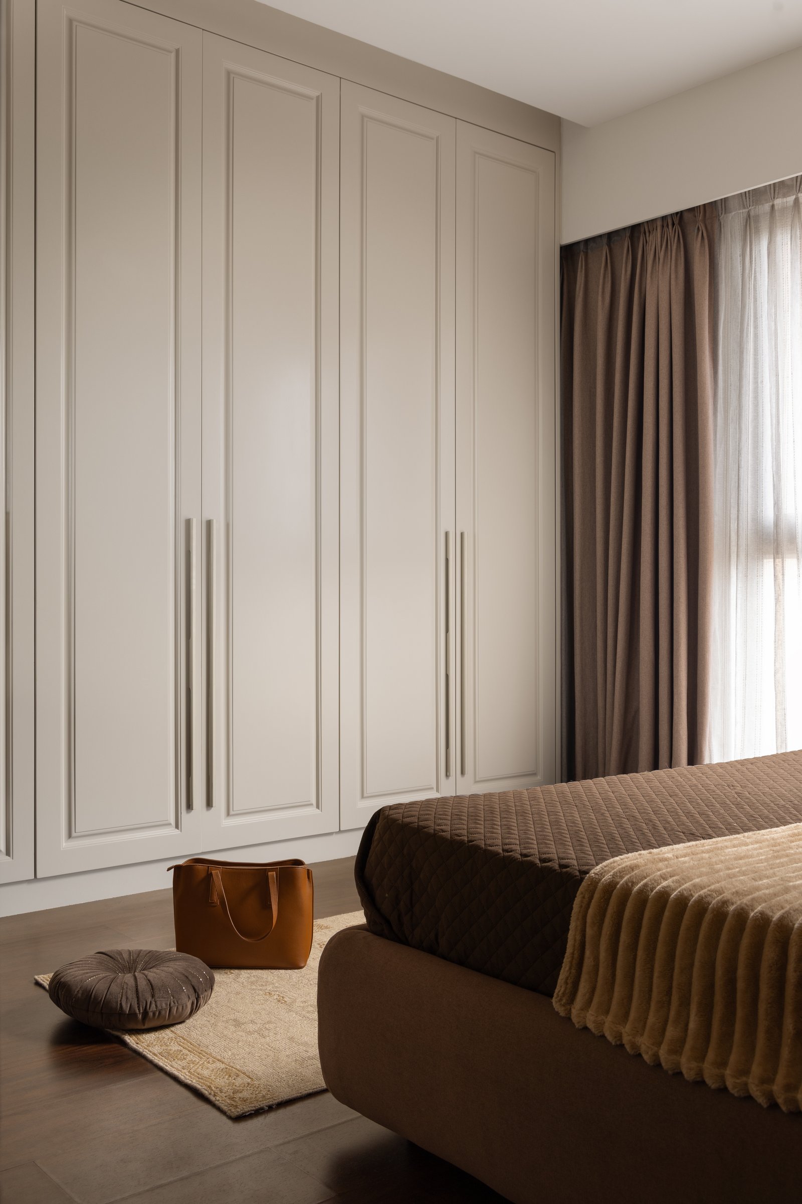
Opposite the bed, a run of full-height cream cabinetry absorbs storage into the architecture with minimal visual interruption. Its raised panelling continues the language established behind the headboard, allowing the practical demands of daily life to recede within the room’s calm, cohesive envelope.
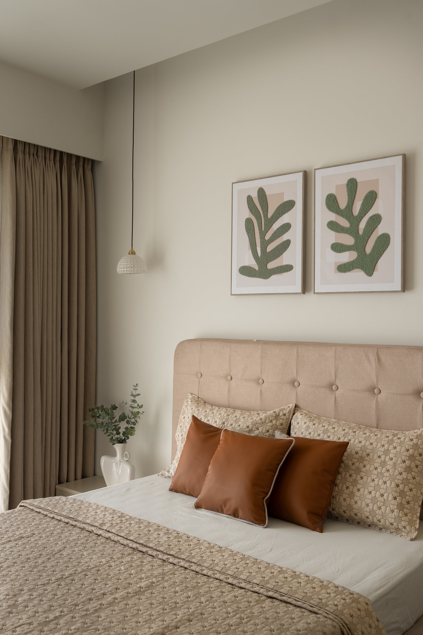
The guest bedroom carries the home’s light-forward language into a more organic register. A button-tufted headboard in warm beige sits beneath a pair of framed botanical prints in muted green and blush, while a small crocheted pendant beside the window introduces a handcrafted note to the otherwise restrained composition.
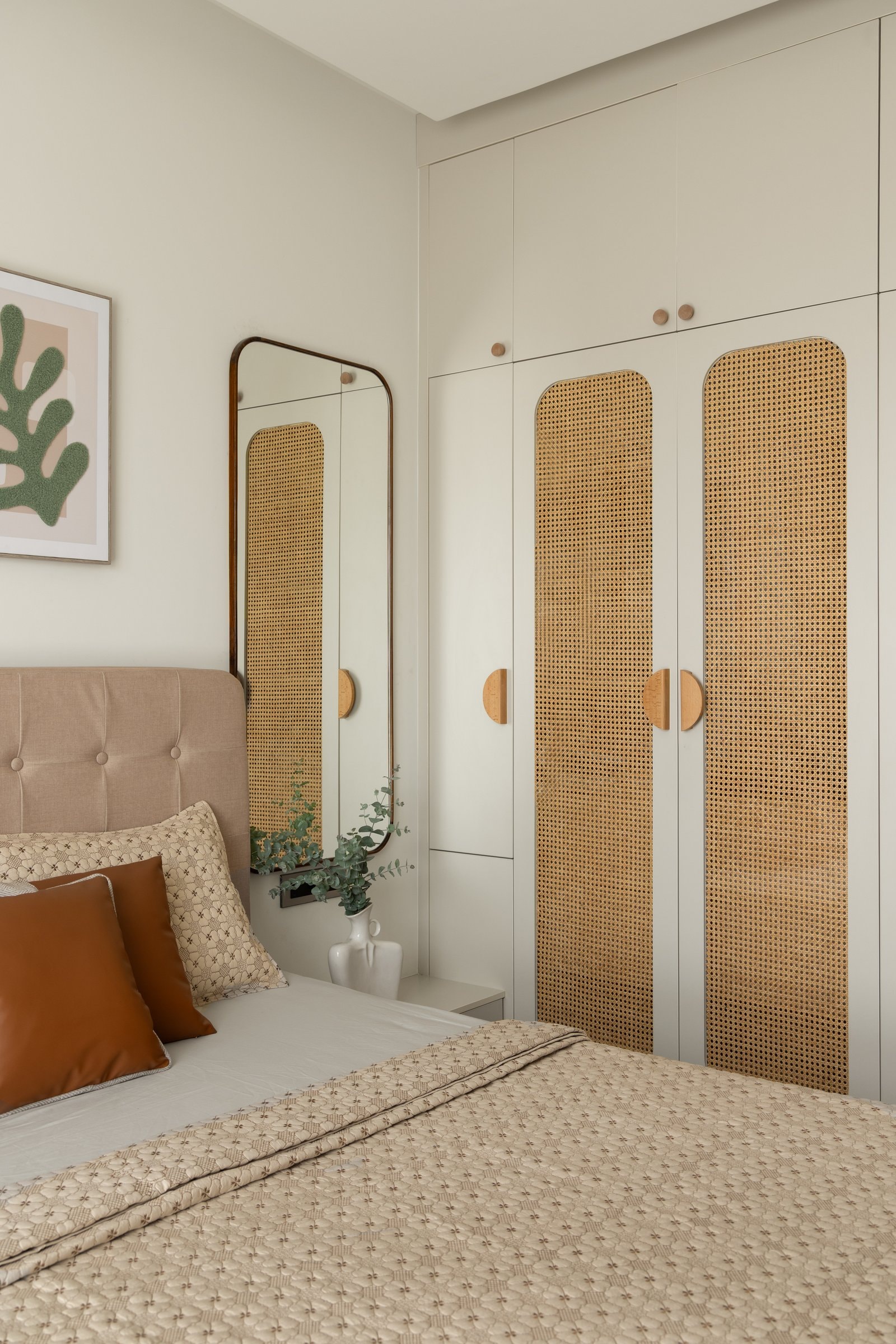
The room’s defining gesture is a full-height run of cream wardrobes inset with woven cane panels, their rounded timber pulls echoing the warmth of the tan leather cushion on the bed. Beside it, a slim rounded-rectangle mirror extends the vertical rhythm of the cabinetry while reflecting light back into the room, lending the compact footprint a greater sense of openness.
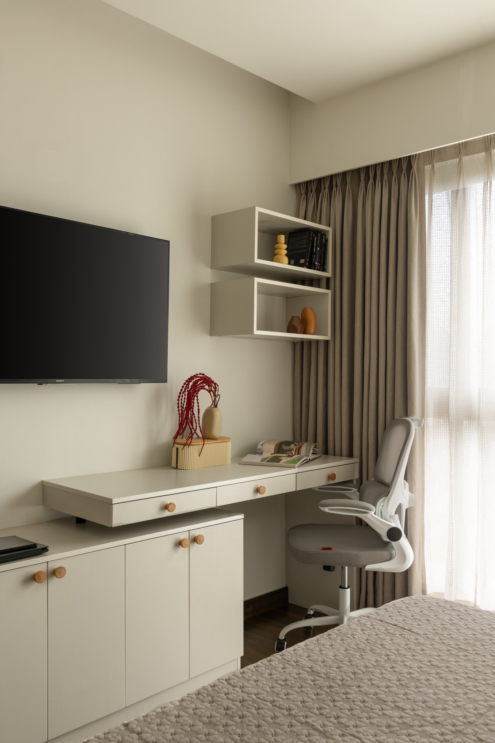
A compact work zone folds the television, desk and open shelving into a single joinery composition, making efficient use of the guest room without adding visual clutter. Rounded timber knobs and a pared-back palette of cream and warm neutrals keep the arrangement understated, allowing the room to shift easily between guest bedroom and quiet study.
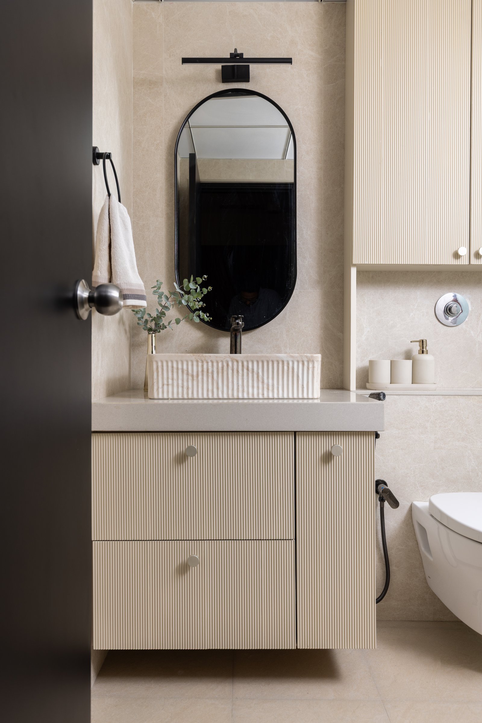
The master bathroom translates the bedroom’s quiet material language into stone and fluted cabinetry. A beige stone-clad wall holds an oval black-framed mirror above a ribbed stone basin, while the fluted vanity below repeats the same vertical rhythm. The continuity of texture gives the compact space a composed, cohesive character without relying on decorative excess.
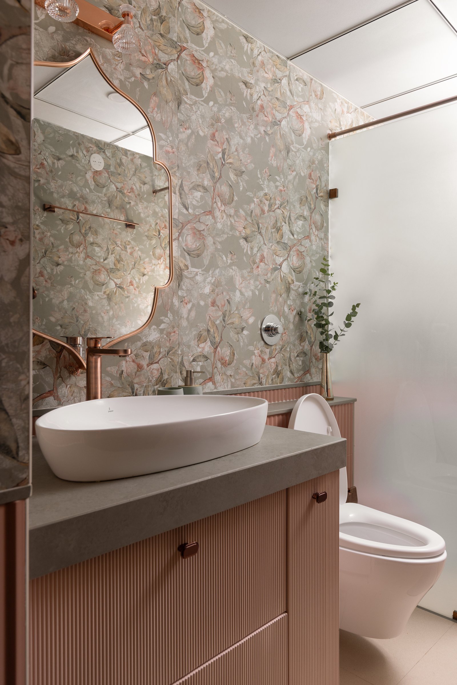
The daughters’ bathroom is the apartment’s most decorative moment. Botanical wallpaper in soft blush and sage forms the backdrop to a curvilinear rose-gold mirror and fluted pink vanity, while copper-toned tapware draws the elements together through a consistent warm metallic register. Playful without feeling overly themed, the room extends the daughters’ bedroom palette in a more expressive direction.
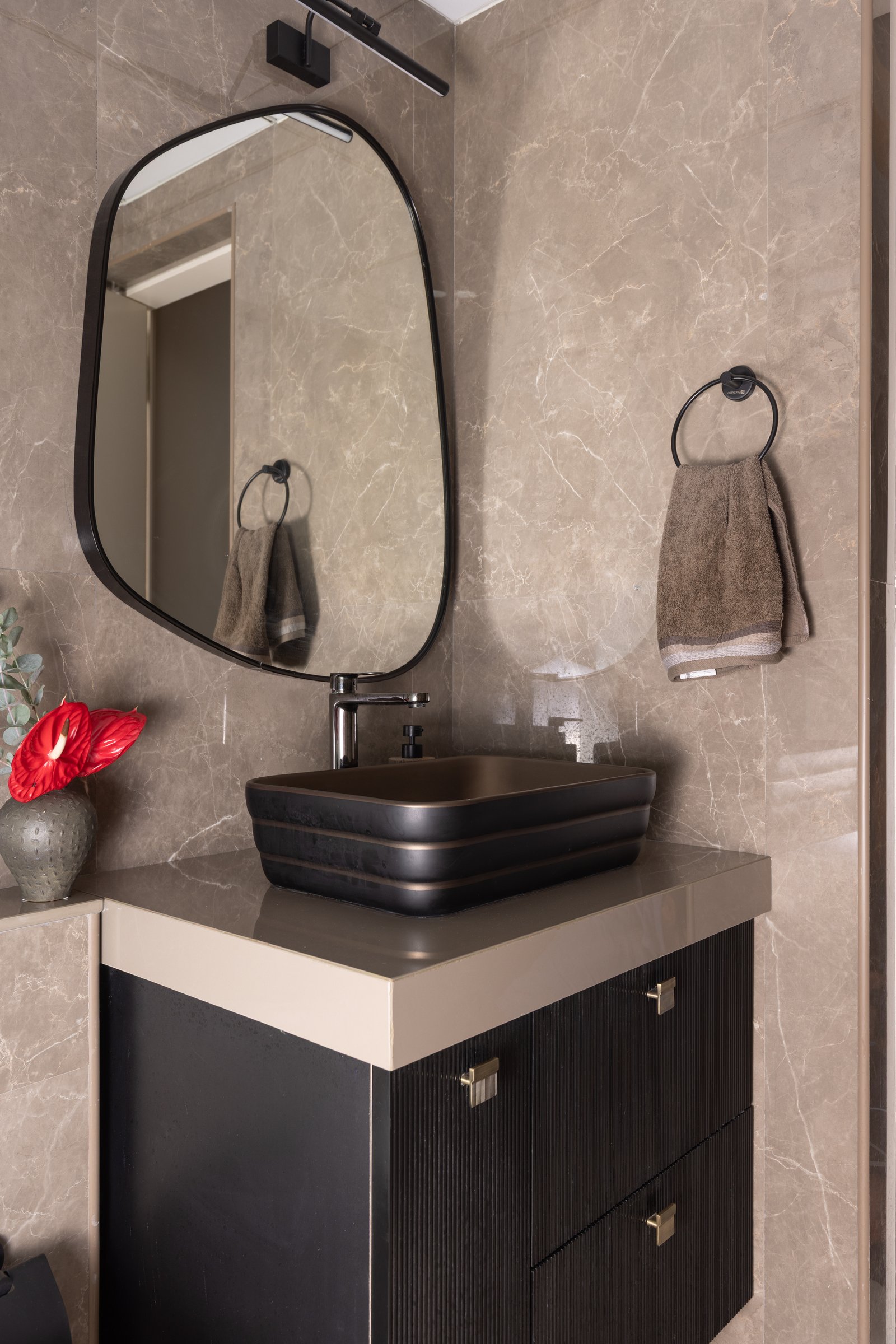
The common bathroom returns to the home’s darker language. Beige stone cladding is set against a black rectangular vessel basin, fluted black vanity and softly rounded black-framed mirror, bringing the apartment’s recurring contrast of light and shadow into a more compact register. The composition closes the spatial sequence with a reminder that darkness here is not simply a palette choice, but the counterpoint through which the lighter spaces gain their clarity.
Within the broader landscape of Bangalore’s tower apartments, where natural light often becomes a defining measure of residential design, Where the Light Lands proposes a more considered position. Panelled walls, arched joinery and warm metallic accents form a familiar vocabulary, but TABA Design Studio organises them around a clear tonal argument rooted in the residents’ daily movement between work and rest.
The apartment’s strength lies in resisting an easy compromise between two opposing design languages. Darkness anchors, light restores, and the movement between them shapes a domestic experience calibrated to lives spent largely in front of screens. In an age of constant notification, the home makes a case for a quieter kind of luxury: the ability, at the front door, to slow down.