Tradition in contemporary Indian homes is often reduced to a decorative gesture: a wall dedicated to a familiar motif, or an artefact placed for effect. Samskrithi proposes something quieter and more considered, treating heritage not as ornament but as a temperament that runs through the home, felt in the shape of a threshold, the pattern of a shutter, or the memory held within a piece of fabric.
Located in Whitefield, Bangalore, the three-bedroom residence was designed by Tesor Designs, with Sharon and Diya Susan leading the project for a couple seeking a home that remained connected to their roots while belonging firmly to the present. Drawing from the essence of a traditional Tamil veedu, where domestic life is shaped as much by ritual and familiarity as by architecture, the design brings together material warmth, handcrafted detail, and a sense of restraint. Its name, meaning culture and continuity, captures this intent: to create a home that holds onto what matters while allowing it to evolve with contemporary life.
Rather than recreating tradition literally, the design translates it through the rituals and details of everyday living, allowing the home to carry quiet traces of the couple’s hometowns and the ways of life they remember. Cultural references are woven into the architecture rather than applied to it, giving familiar forms and materials a contemporary expression. In doing so, aesthetics, functionality, and emotional connection become complementary layers of a single design language, creating a home that feels rooted without being nostalgic.
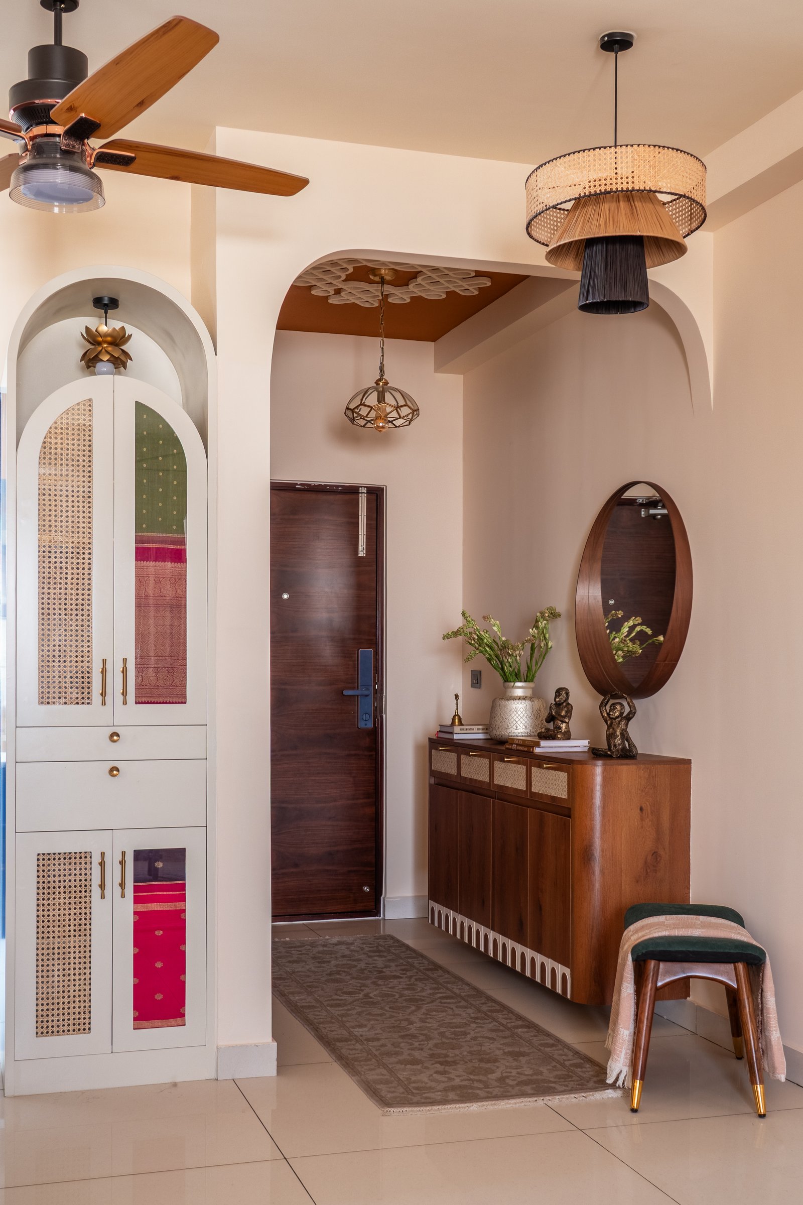
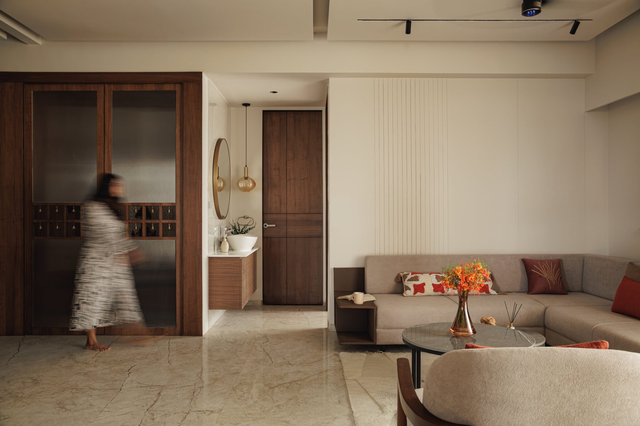
The foyer establishes this philosophy immediately. Overhead, a rangoli inspired pattern drawn by the client’s mother is worked into the ceiling of the arched entry, giving the threshold a distinctly personal layer. Below, the console takes its sculptural form from the gentle curves of an elephant’s legs, translating a familiar cultural reference into a more abstract and contemporary expression.
Set alongside it, a tall cabinet with woven inserts and framed panels of Kanjeevaram style fabric transforms the family’s textile heritage into an architectural detail. What might otherwise have been an ordinary storage wall becomes a repository of memory, with saree textiles held within wooden frames as objects of personal and cultural significance.
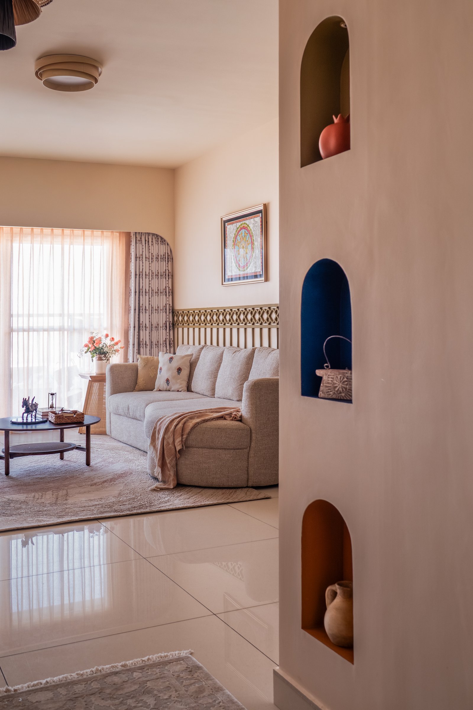
Moving into the living room, the design unfolds around a soft neutral sofa, a rounded arched backdrop, and a series of small niches carved into the adjoining wall. Painted in deep blue, terracotta, and ochre, each niche holds a single object, from a pomegranate and woven basket to a clay pot. The gesture is subtle yet deliberate, introducing colour and cultural references with restraint, allowing them to become part of the room’s composition rather than its defining feature.
““The traditional influences appear through subtle details rather than dominant statements, allowing the space to feel comfortable, layered and naturally connected to the overall narrative of the home.””
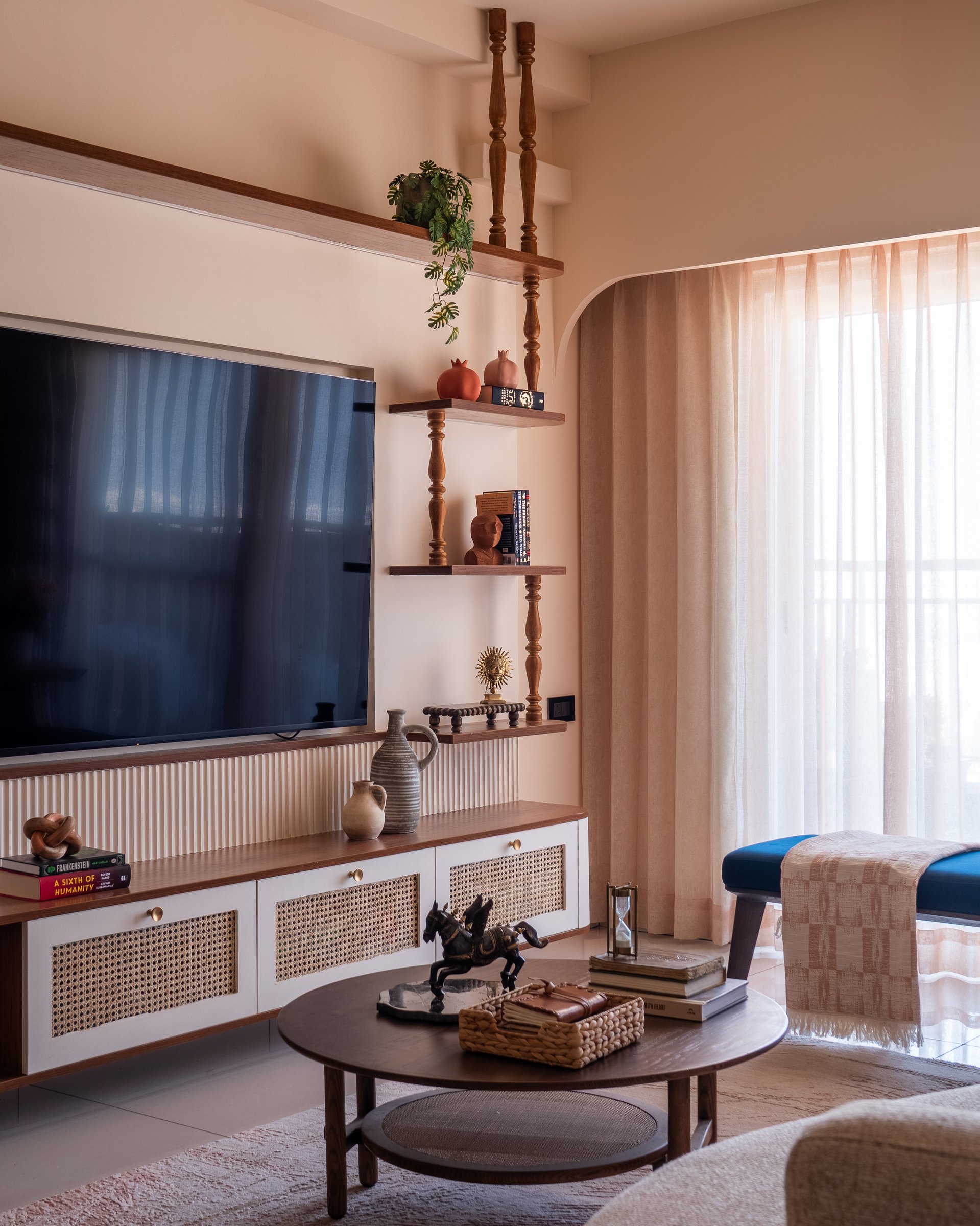
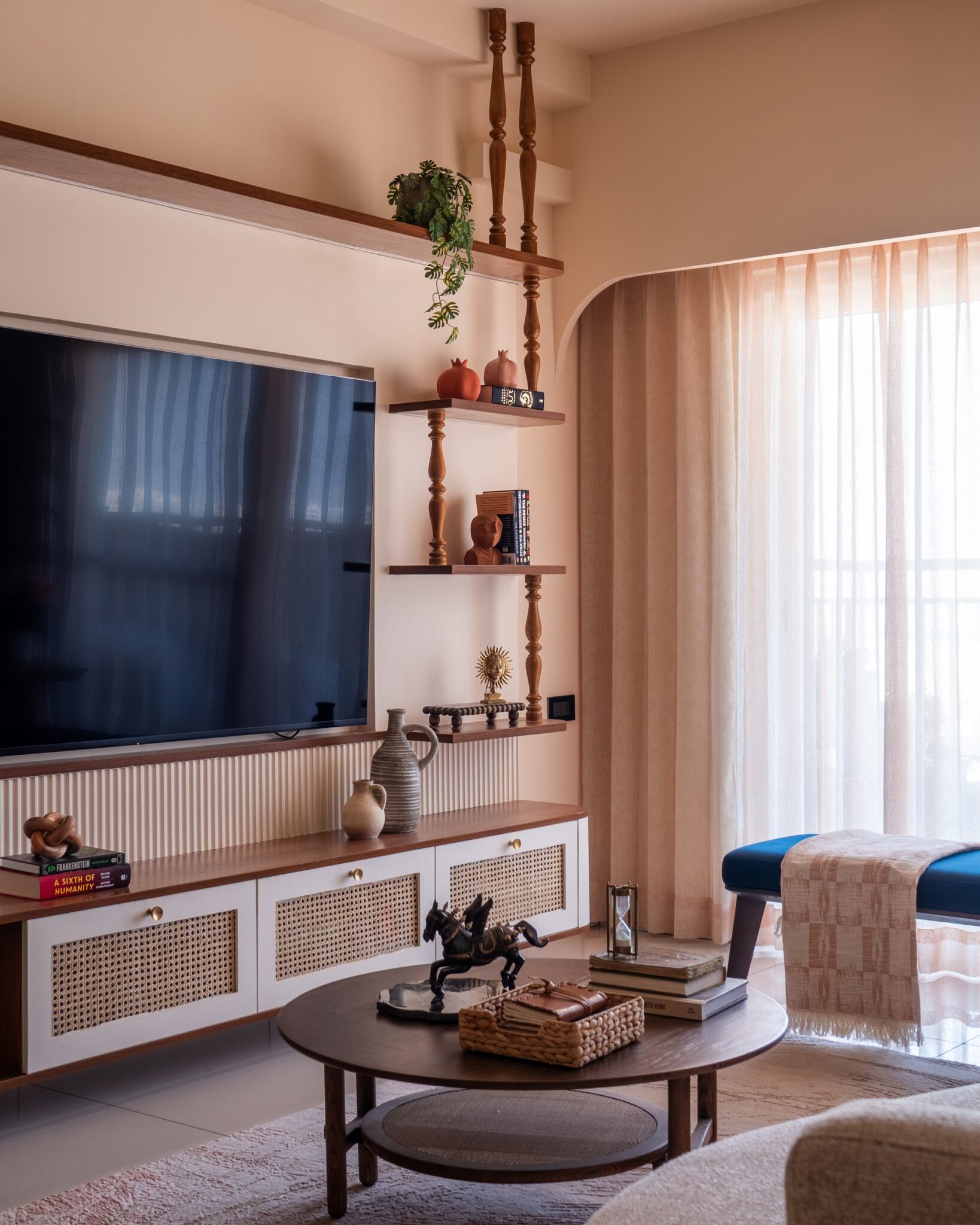
Opposite the seating, the media wall introduces a more contemporary vocabulary while remaining connected to the home’s broader material language. A reeded lower section grounds the composition, while open shelving punctuated by turned wooden spindles offers a lighter interpretation of traditional kadasal detailing. Cane fronted cabinetry and brass pulls complete the composition, appearing as recurring accents rather than overt decorative statements.
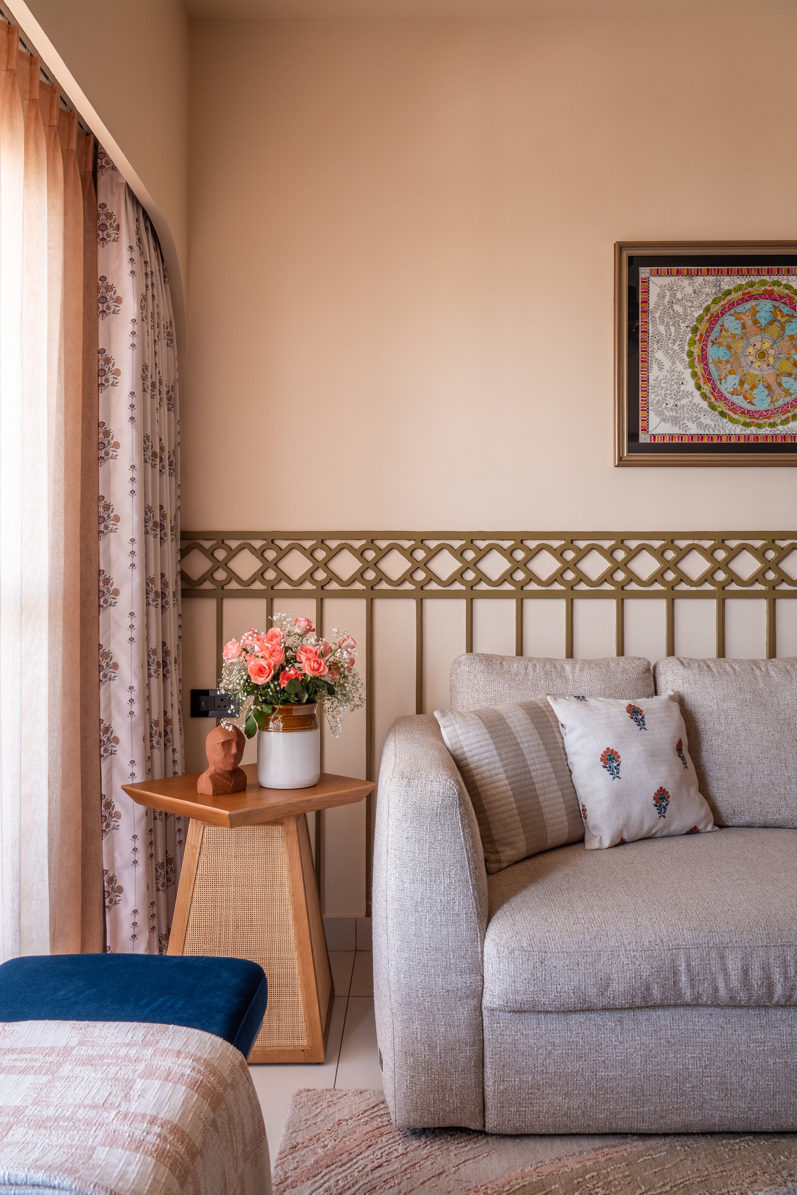
A second corner of the living room reveals a quieter layering of detail behind the seating. A decorative metal grille runs along the lower wall, its interlocking geometry functioning as both screen and wainscoting.
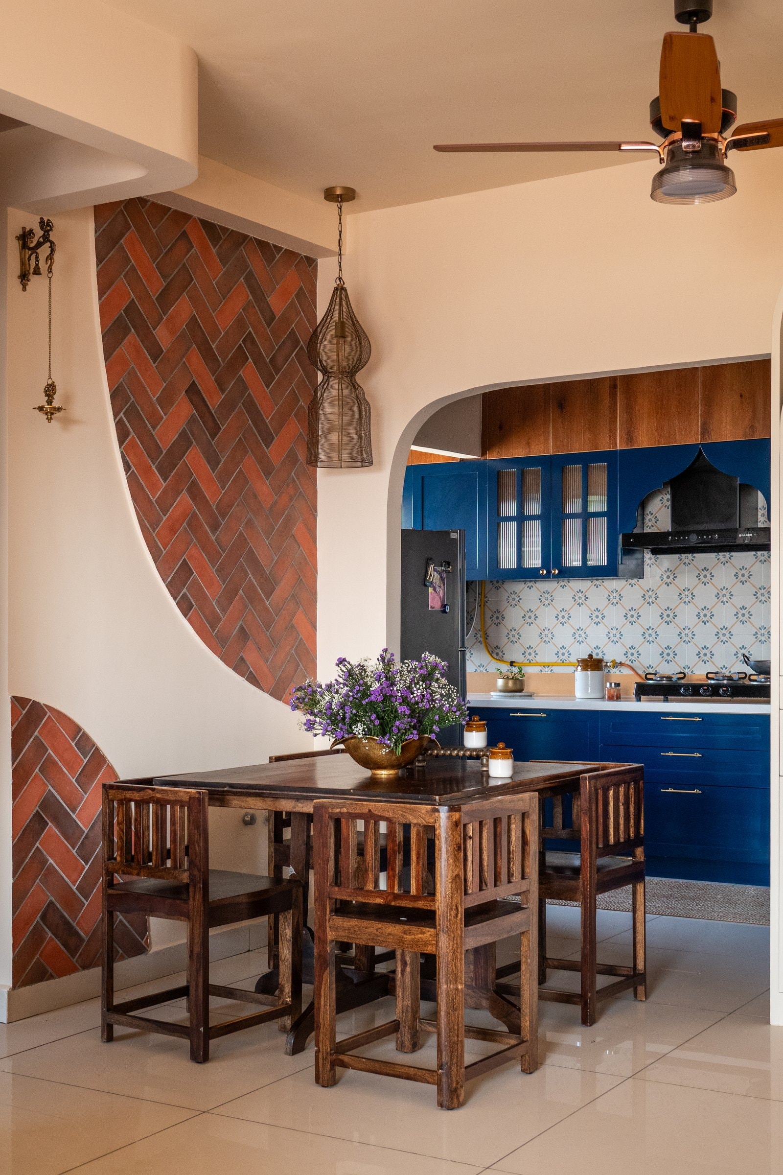
The dining area, positioned between the living space and kitchen, is defined by a sweeping arc of terracotta toned tiles laid in a herringbone pattern. The curve softens the transition between the two zones while giving the space a distinct architectural focal point. Suspended above the wooden dining table, a slender metallic pendant introduces a contemporary counterpoint to the textured tiled backdrop.
Warm toned wooden chairs with slatted backs echo the linear detailing that recurs throughout the home, creating continuity between spaces. Together, the restrained furniture, sculptural lighting, and tactile wall treatment give the dining area its own identity while preserving the visual language established across the residence.
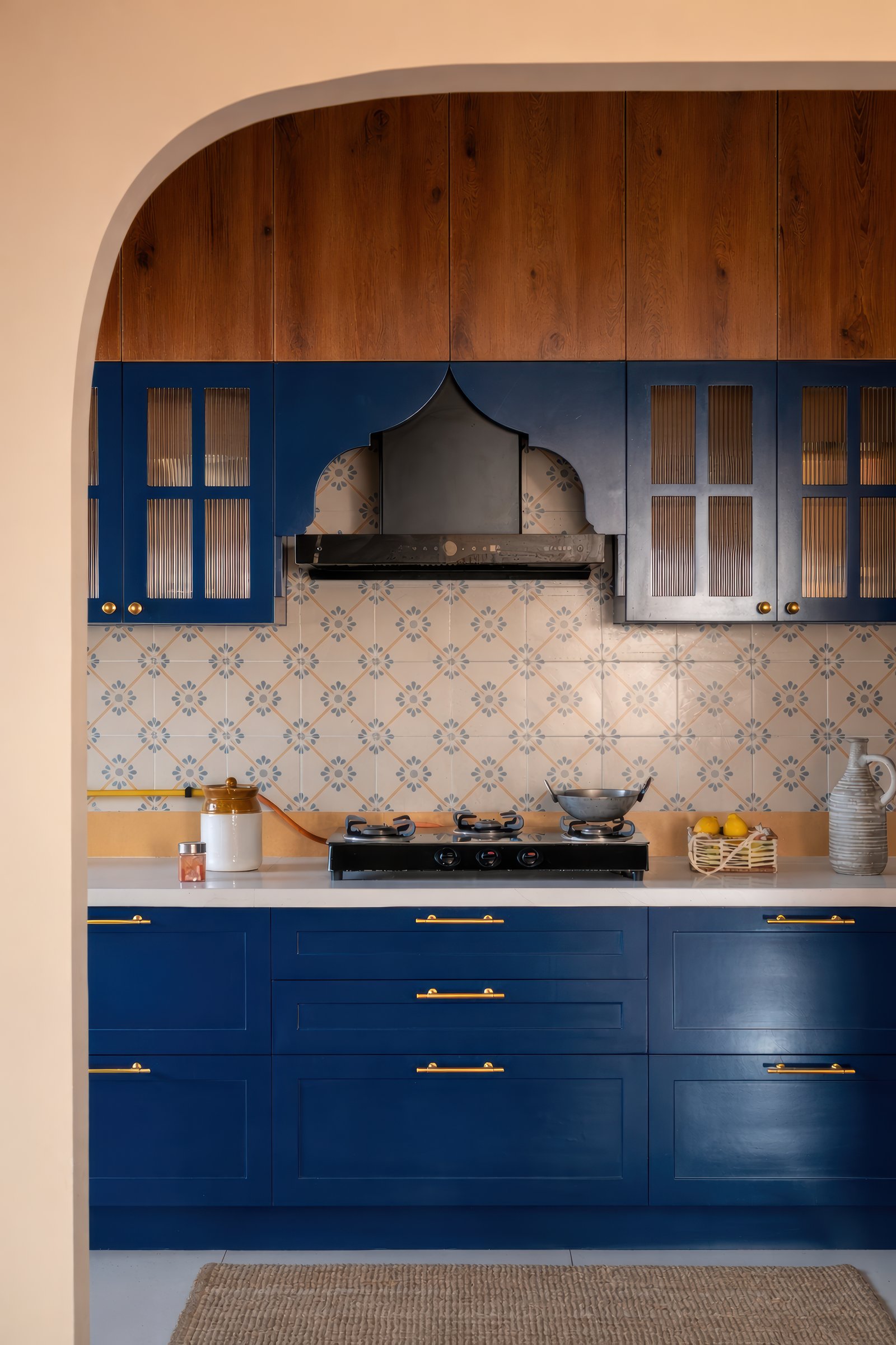
Through the arched opening, the kitchen introduces a subtle shift in the home’s palette. Deep blue cabinetry, chosen instinctively by the clients, is paired with brass detailing, lending the space a gentle vintage character while remaining connected to the residence’s broader design language. Patterned encaustic style tiles in muted blues and warm ochres line the wall behind the counter, while warm toned upper panels soften the depth of the blue and bring balance to the composition.
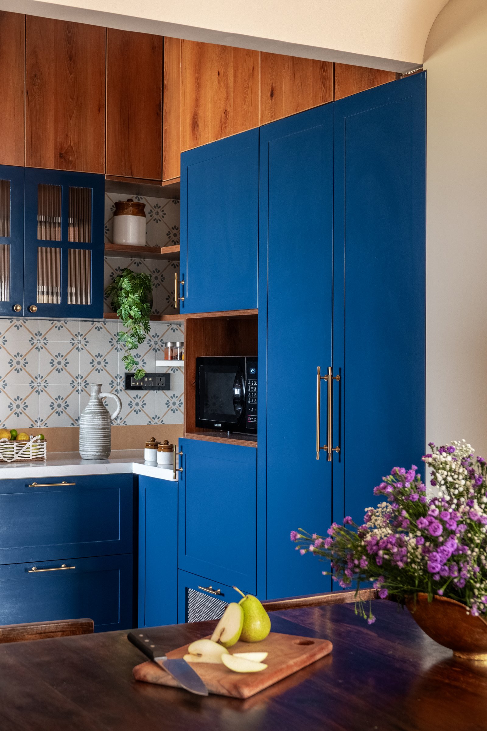
The kitchen’s tall storage volume continues the same disciplined material palette, while reeded glass cabinets along the adjacent wall offer glimpses of ceramics and greenery arranged within. Slender brass pulls extend vertically across the doors, lending the cabinetry a sense of height and rhythm. A dedicated microwave niche is finished in the same warm wood tone as the upper cabinetry, allowing the appliance to sit more quietly within the surrounding joinery.
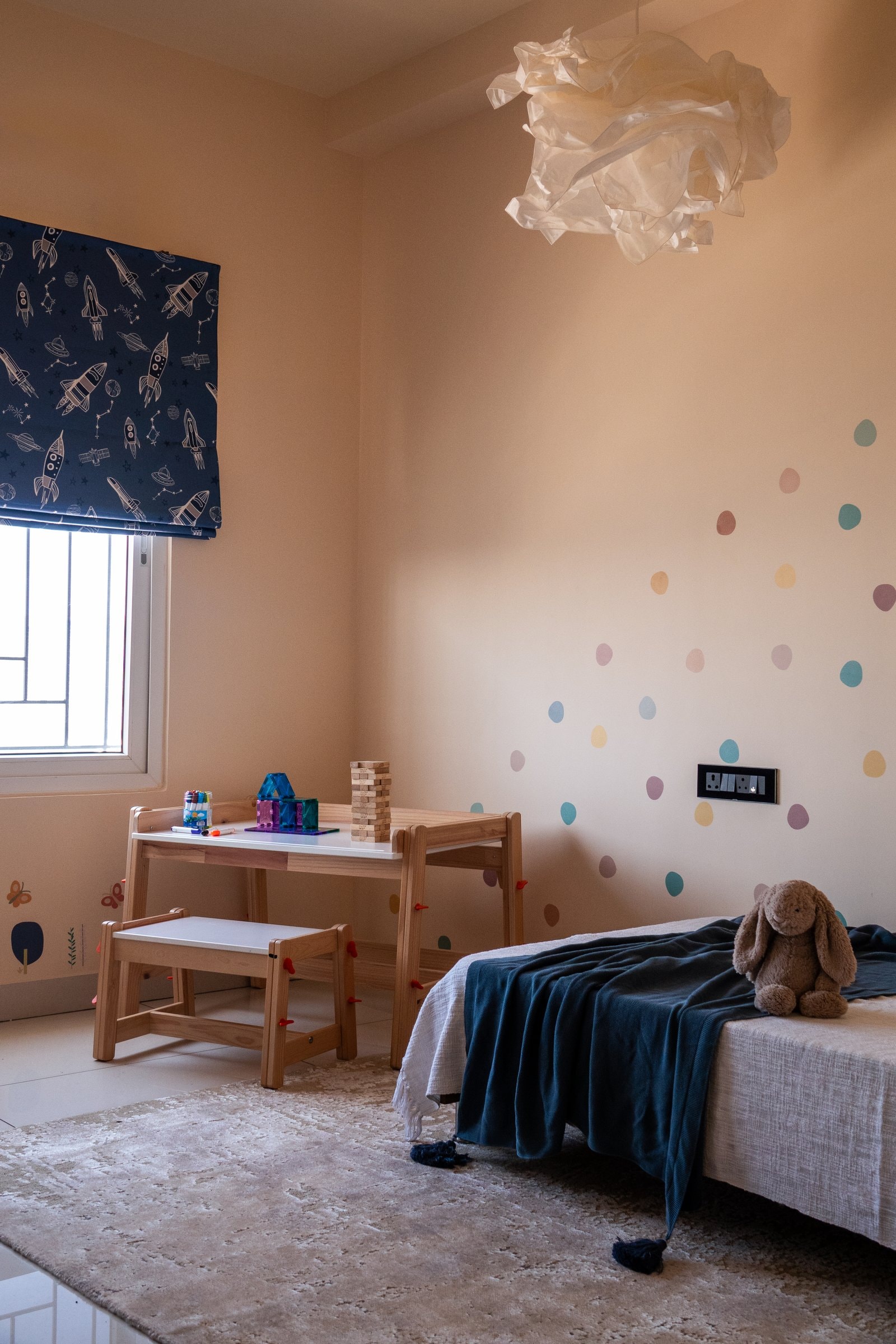
The kids’ room takes the home’s design language in a softer, more playful direction, conceived as a space that can evolve with the child. Soft neutral walls, hand painted dots in muted pastels, and a sculptural cloud like pendant introduce a sense of whimsy without becoming overly thematic. Beneath the window, a compact wooden desk and bench are paired with a navy space print shade, allowing one bolder gesture to animate an otherwise restrained and quietly playful room.
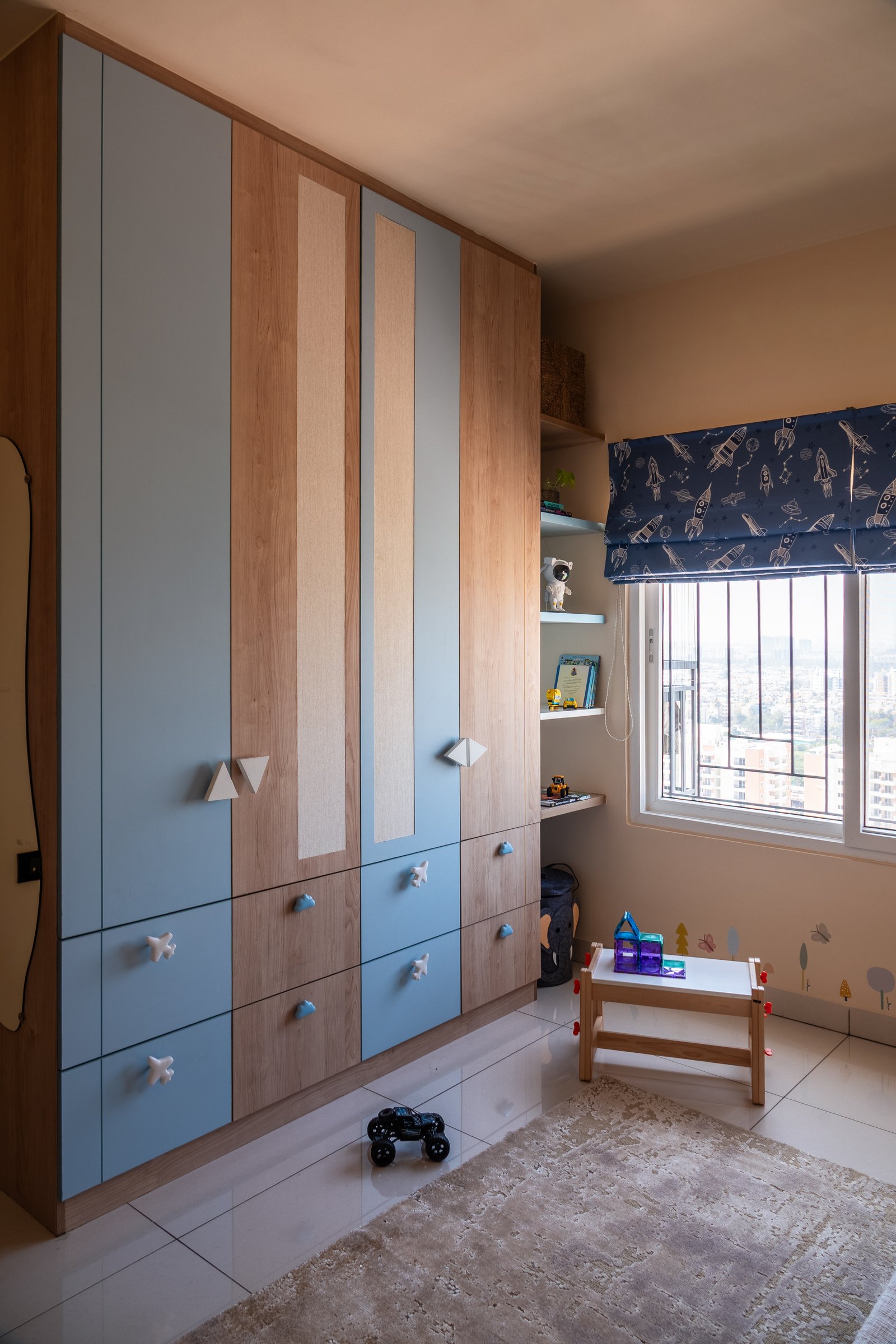
The wardrobe wall extends this approach, turning storage into an opportunity for pattern and detail rather than treating it as a purely functional element. Panels alternate between dusty blue and warm wood tones, punctuated by playful pulls shaped as small aeroplanes and geometric forms. While the clients initially envisioned natural cane, a layered veneer interpretation was developed to retain its textural character while offering greater durability for a child’s room.
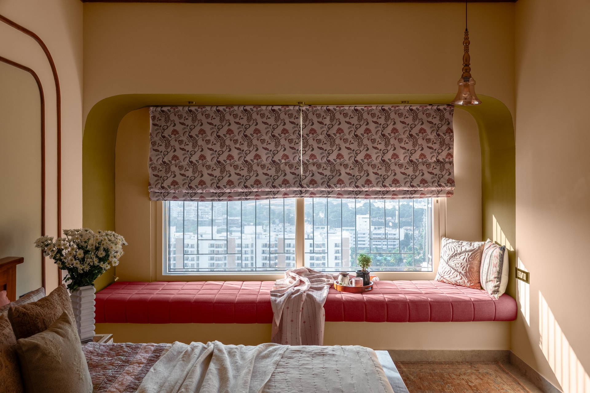
In the master bedroom, a deep arched niche frames the window and a generous built in seat upholstered in a warm coral tone. A mustard toned surround accentuates the opening, its curved edges softening the geometry and transforming the window into an inviting corner within the room. Alongside, a slender pendant in blush toned glass adds a delicate note of warmth to the composition.
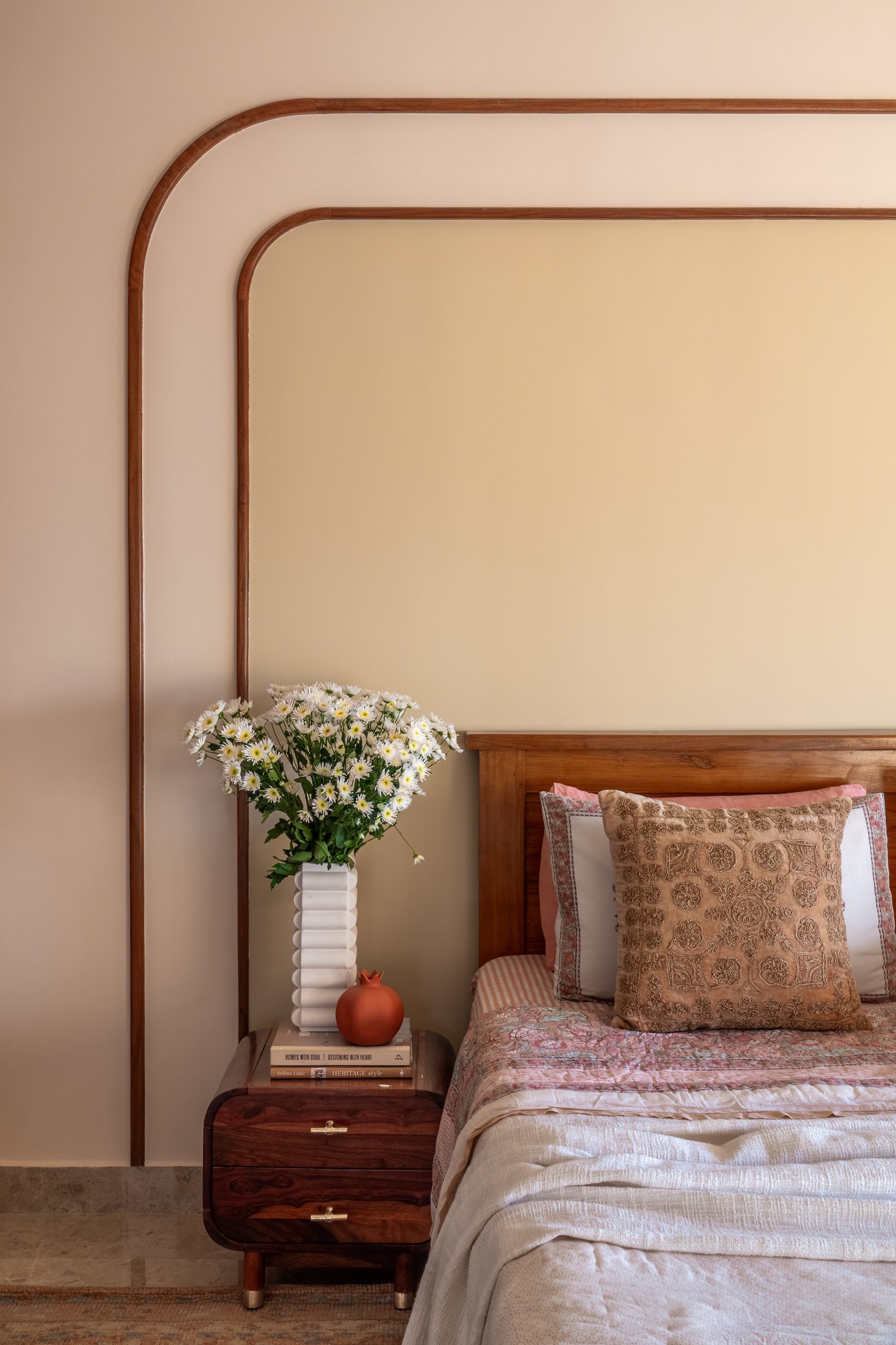
The bed itself sits against a wall marked by concentric rounded frames in warm wood, their soft curves outlining the headboard area and echoing the arches seen throughout the home. The composition feels calm, intimate, and deeply comforting.
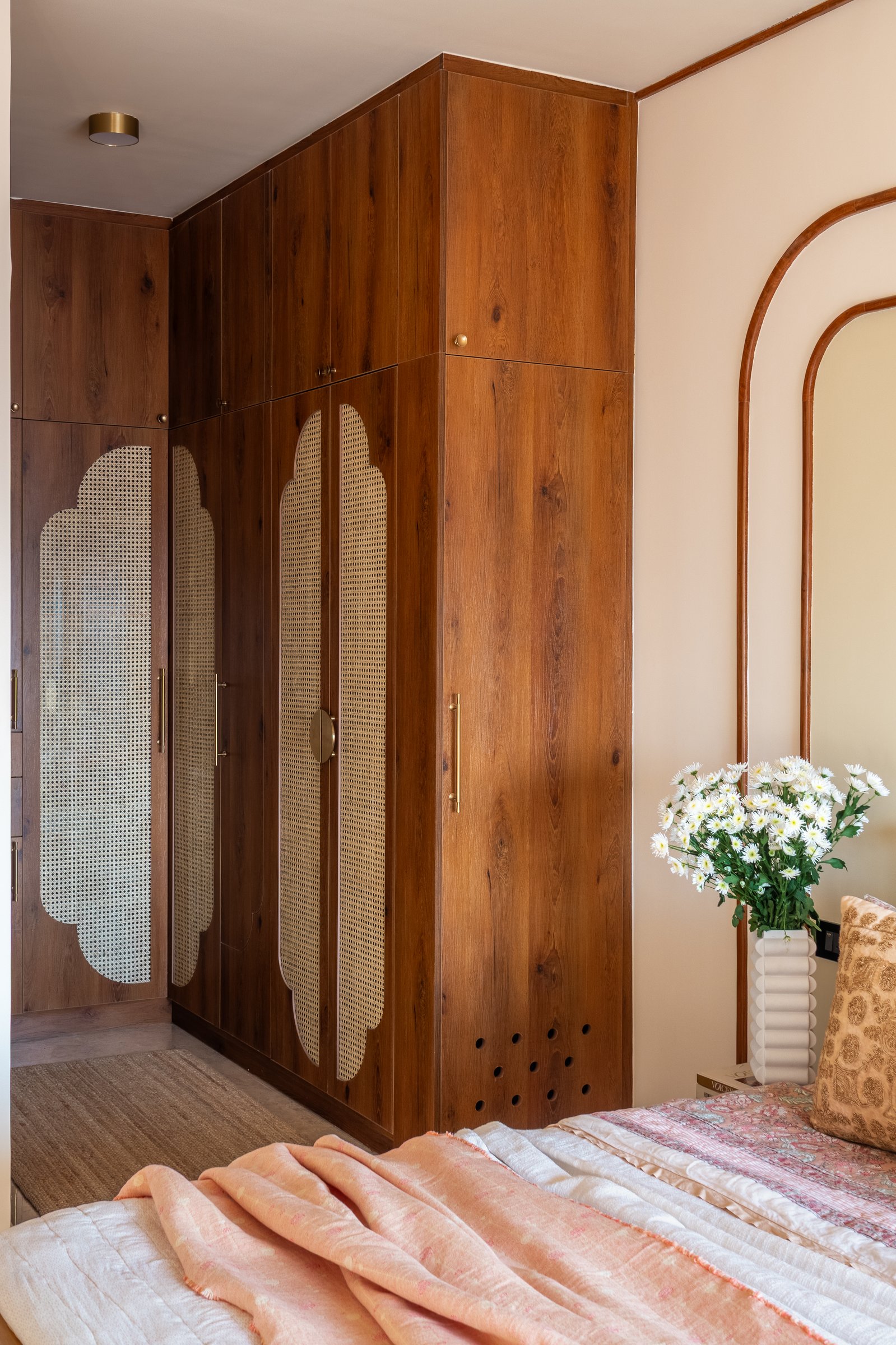
The wardrobe opposite carries the master bedroom’s material language into a more architectural expression. Full height doors in warm toned wood are punctuated by cane woven panels shaped into scalloped silhouettes, subtly referencing Indian temple architecture through contemporary joinery. The composition gives the wardrobe a strong architectural presence while remaining restrained enough to sit quietly within the room.
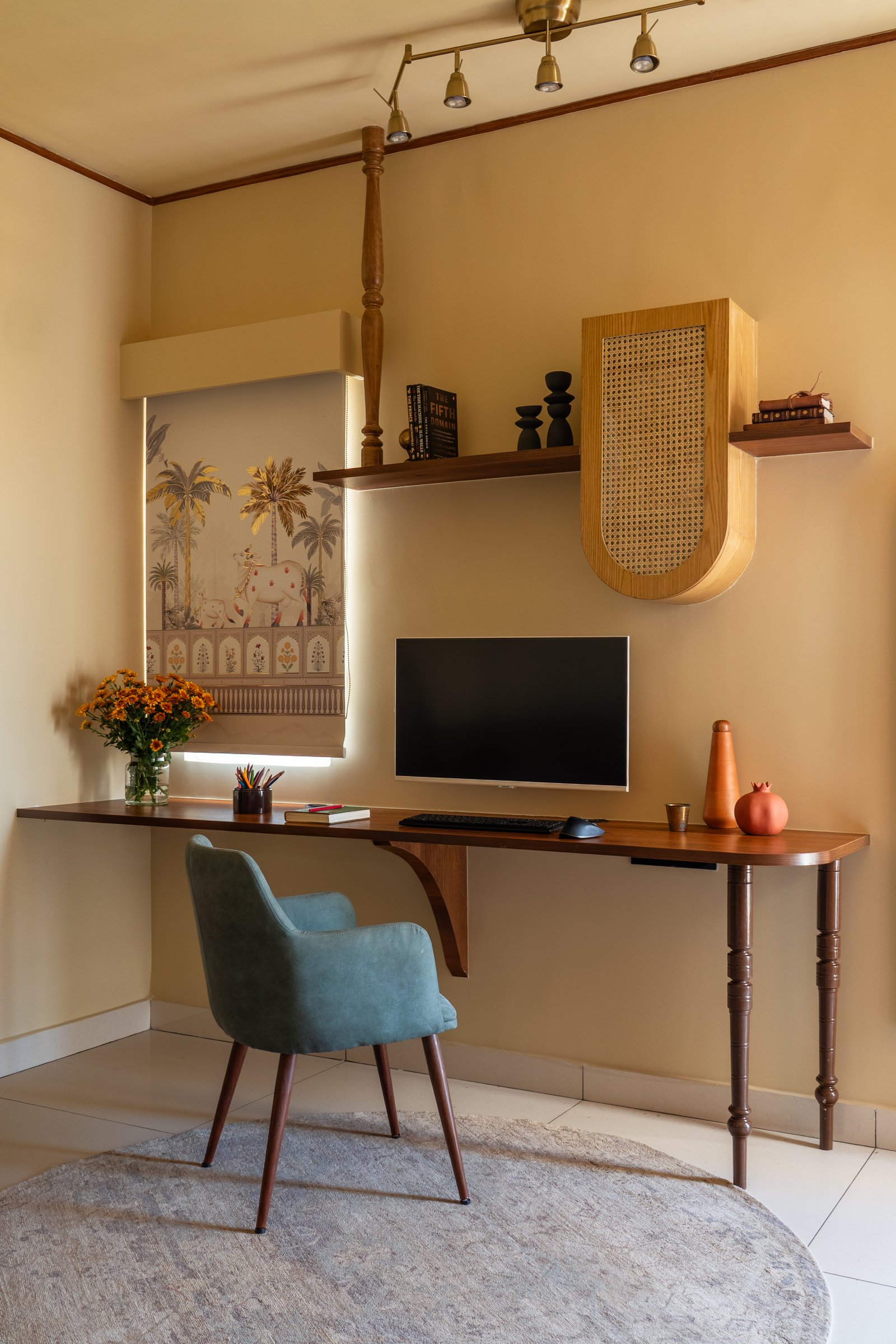
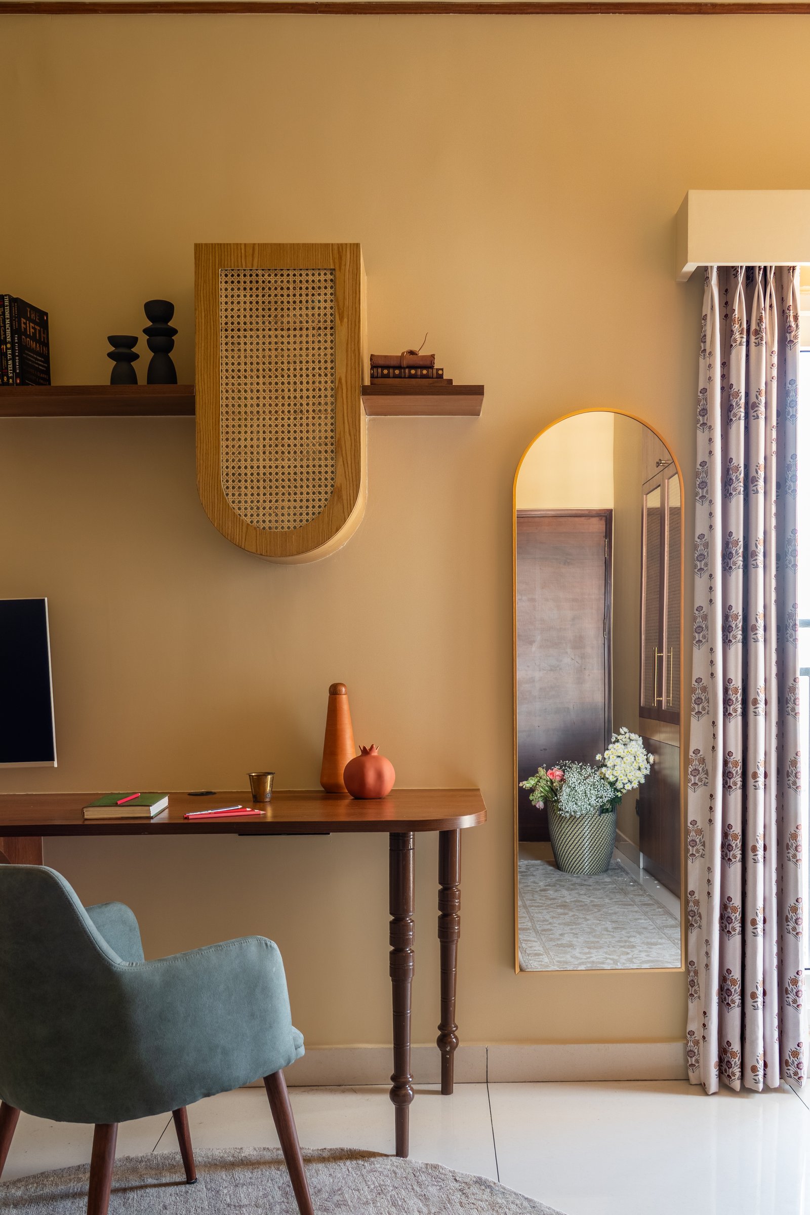
A dedicated work corner continues the home’s layered design language in a warmer, more saturated setting. A long wooden desk extends beneath a track of brass spotlights, supported by a wall mounted bracket at one end and turned wooden legs at the other. Floating shelves above display sculptural objects against a cane panelled wall feature, adding texture and depth to the composition.
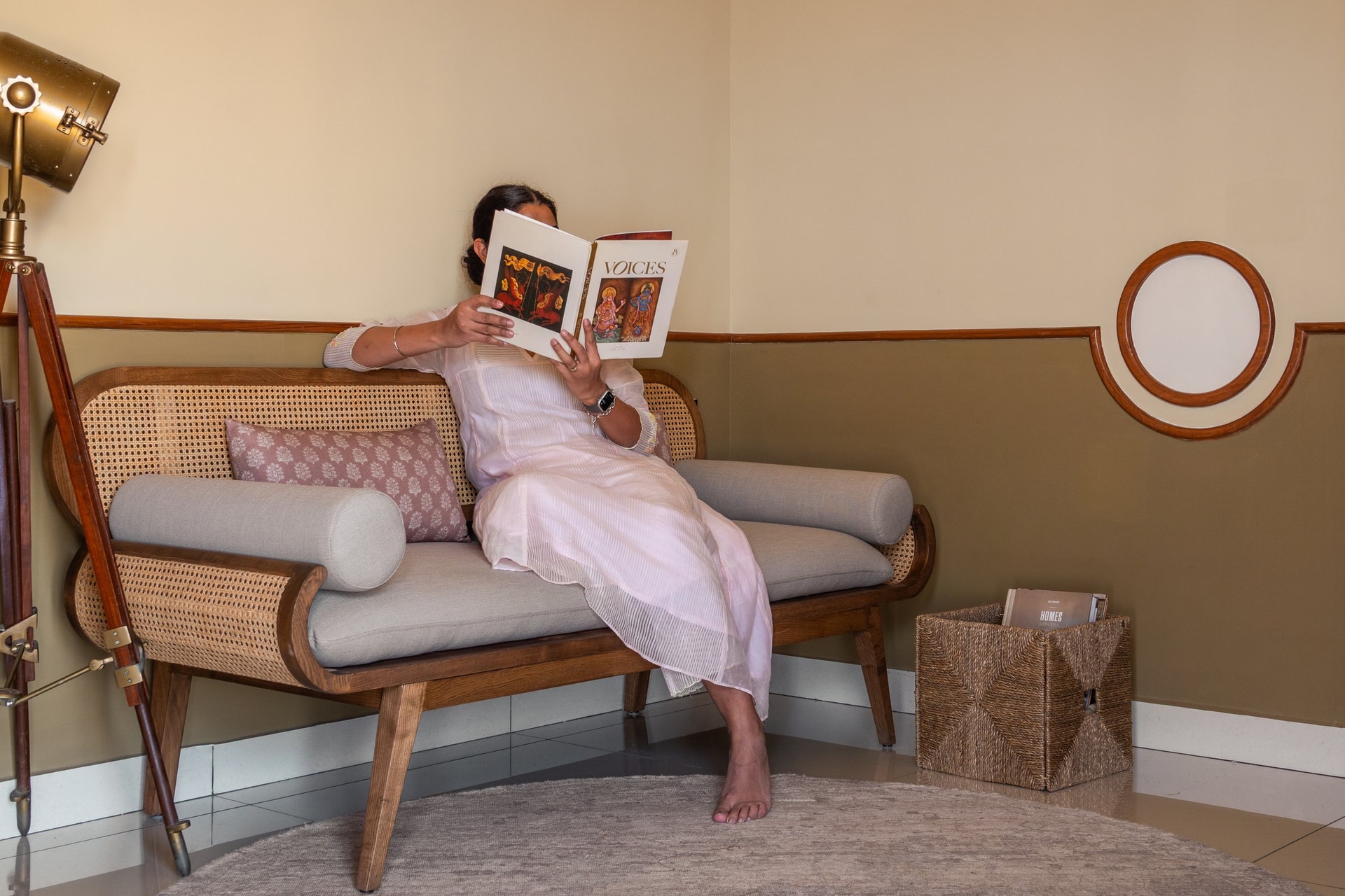
A quiet corner of the home, anchored by a cane backed settee and a tripod floor lamp, distils the residence’s design language into a more intimate setting. The lower half of the wall is finished in a warm olive tone and edged with a slender wooden trim, while a small circular frame introduces a subtle decorative detail. Conceived as a space for reading and pause, the corner reflects the home’s emphasis on creating room for slower, more considered moments of everyday life.
Samskrithi participates in a growing conversation within contemporary Indian design, one that approaches heritage not as a collection of motifs to be applied, but as a sensibility woven into everyday life. In Bangalore, where residential interiors often gravitate towards a more globally familiar minimalism, the home offers a layered alternative, shaped by cultural references, material warmth, and details that carry personal meaning.
The result is a residence where colour, material, and memory come together with a sense of quiet continuity. Tradition is not performed but lived, emerging through the shape of a shutter, the pattern of a tile, or the saree textiles framed within the foyer. Rather than looking to the past through nostalgia, Samskrithi allows heritage to become instinctive, evolving naturally alongside the rhythms of contemporary life.