Minimalism, when it works, is never a stylistic choice; it is a discipline. The home that practices it cannot rely on what it adds. It must trust what it withholds, and that trust shows itself in proportion, in the tone of a surface, in the way light is permitted to behave on a wall that has been left, deliberately, with nothing on it.
This is the argument Kanso Haus makes, quietly and at length. Designed by Eureka Design for a family that had lived in the same Pune penthouse for over fifteen years, the project takes a conventional 3BHK with compartmentalised rooms and reorganises it into a more generous 2BHK that finally fits the way they live now. Principal architects Utkarsha Kulkarni and Shaunak Kajalkar push the plan open, extend the windows, and resolve every line of kanso, the Japanese principle of intentional simplicity, against the practical demands of an Indian household that still needs to store everything.


The threshold sets the grammar before the home truly begins. A chevron-grain door in pale wood sits within a wider portal of vertical plank panelling, lit by a single linen-shaded pendant whose shape softens everything beneath it. A dark stoneware vessel holds a spray of dried branches, an exercise in restraint rather than decoration.

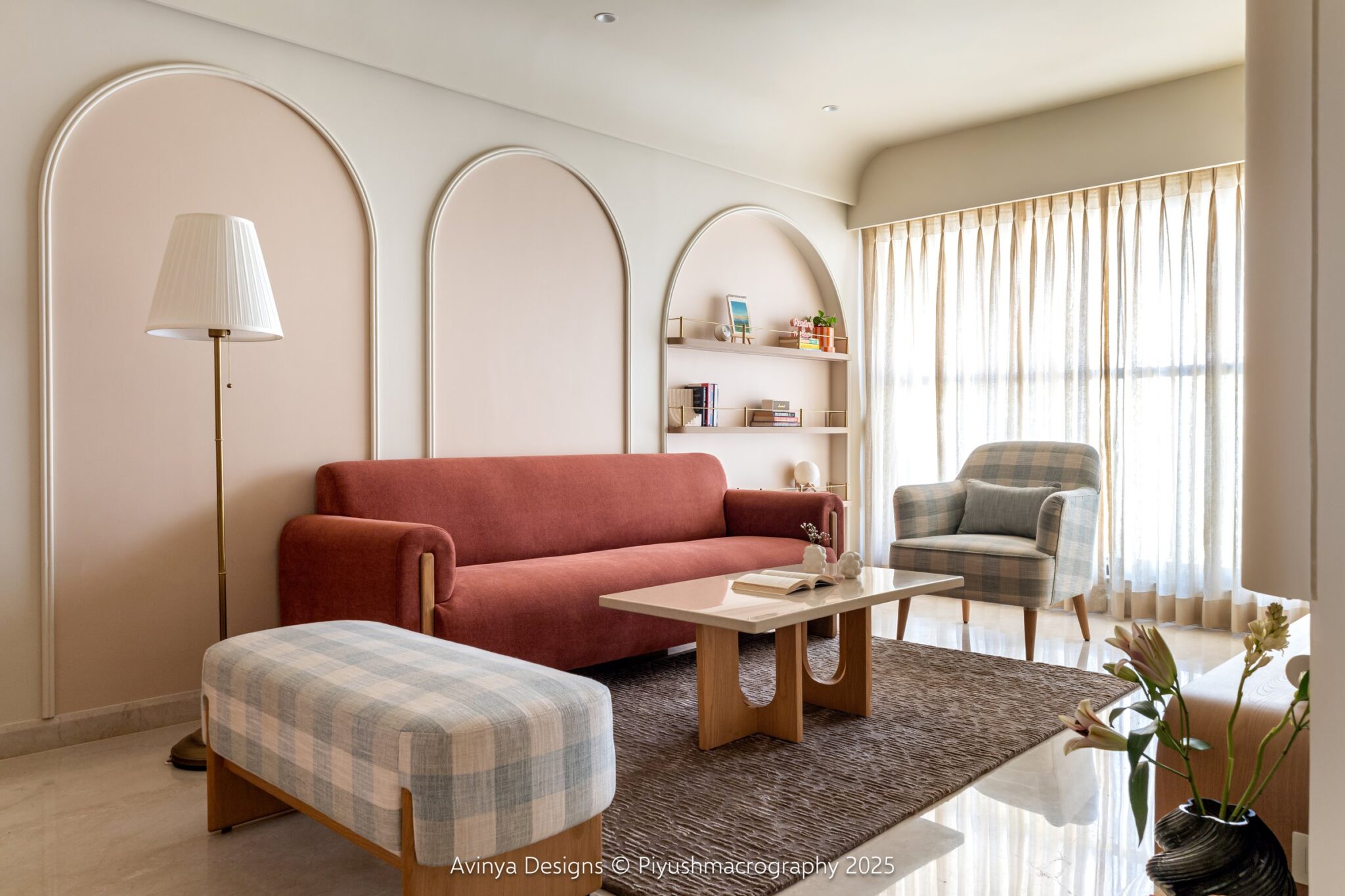
The living room is the project’s central thesis, and it makes its case by holding two opposing materials in the same frame without apology. A red brick wall, sourced from the Bombay Brick Store, anchors the television end of the room; opposite it, a deep window seat in boucle floats above a long bank of integrated drawers. Between them, a jute rug, a travertine-topped coffee table, and a single walnut lounge chair do all the social work.
The room reads as small only until you notice how much it actually holds. The window seat is storage. The console below the television is storage. The wood-clad volume that frames the staircase is storage. None of it is visible as such, which is the whole point.

Seen from the other end, the brick wall reveals its true role: it is the room’s one extravagance, and it earns its place. A soldier course runs horizontally above the television line, a small craft gesture that breaks the rhythm without breaking the calm.
““Each piece is carefully designed, allowing the space to breathe while still feeling complete.””

Look up, and the room’s architectural ambition reveals itself. A series of shallow vaulted arches, finished in wood-grain panelling, runs across the ceiling above the seating, softening what would otherwise be a flat slab into something gentler. A brass-stemmed ceiling fan with dark blades hangs against the warm wood, more sculpture than appliance.
The micro-concrete plinth that steps up to the window seat is the room’s quietest detail. It does the work of a level change, a side table, and a transition to the staircase, all in a single continuous surface.

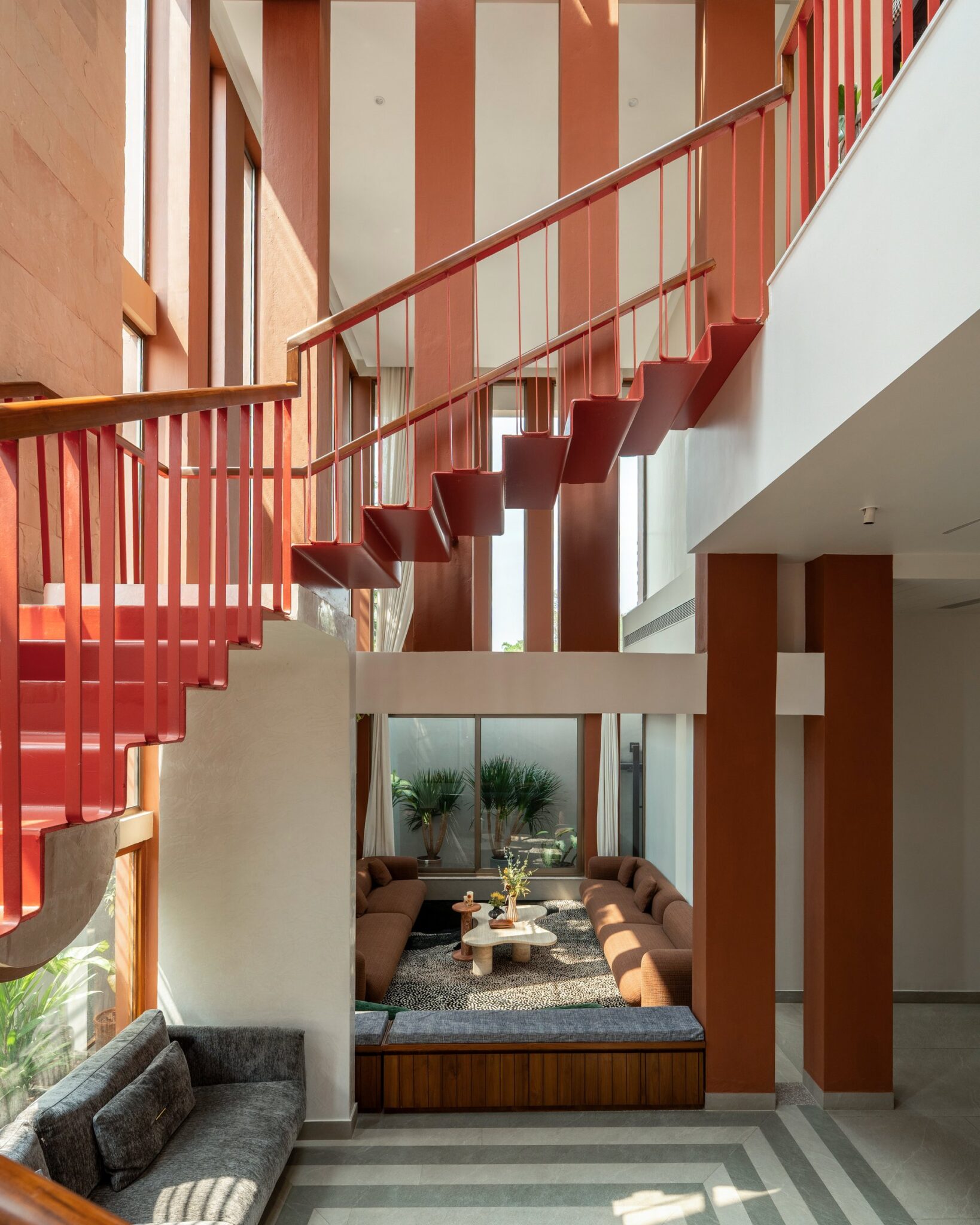
The staircase is the apartment’s one moment of structural drama, and even here the studio refuses spectacle. Treads in blackened steel cantilever from a hidden spine, suspended by slim brass-bound rods that catch light without insisting on it. Beneath, a boucle sofa, a dark-wood framed armchair, and a round wood coffee table with stone top compose the room’s secondary seating with absolute economy.
The pairing matters. A staircase this dark, hung above a palette this pale, could easily fracture the room. Instead it grounds it, the way a single bold sentence anchors a quiet paragraph.

The dining room is approached through a corridor of full-height timber cabinetry with thin vertical reveals that read as line drawings on the wall. At the end of the passage, a round wood-veneer table on a fluted pedestal sits beneath a flattened linen pendant, a green view filling the window behind it.
The room is, in effect, a single composition framed by storage. Every cupboard the household needs is here, in those tall doors, and yet the eye registers only the table, the light, the palm fronds beyond.

Off the dining axis, a central niche holds the family’s gilded Krishna figure, flanked by glass-fronted vitrines displaying a curated set of heirloom objects. The detailing is precise: thin black metal frames, glass shelves, a pale wood interior that sets each piece against a warm ground.
This is where the project’s restraint shows its cultural intelligence. The devotional shelf has not been hidden, nor has it been monumentalised. It is given its own architectural moment within the dining room’s wall, lit and proportioned with the same care as everything else.

The kitchen is where the home permits itself a single registered note of colour. Lower cabinetry in a deep terracotta-red runs the length of the run, paired with veined stone counters and backsplash and softly fumed upper units with mullioned glass fronts. The colour does not shout; it grounds the room against the marble’s movement.
The mullioned upper cabinets are the small surprise. They introduce a hint of older Indian kitchen vocabulary into an otherwise contemporary palette.

The master bedroom shifts the project’s tonal register entirely. Walnut panelling wraps the headboard wall and ceiling, the grain running long and continuous across both planes; an ikat-patterned upholstered panel sits above a cream channel-fluted headboard, flanked by wall sconces with tapered drum shades on brass arms.
After the pale composure of the living spaces, the warmth here feels deliberate, an interior that knows the difference between the rooms where a household lives in public and the room where it sleeps.

The same room rewards closer attention. A bedside cabinet in walnut with a stone top and blackened steel pull sits beside a tall wardrobe whose doors are inset with framed panels of the same ikat textile, a small piece of joinery thinking that turns storage into ornament.
It is the kind of detail that distinguishes a designed bedroom from a furnished one. The wardrobe is not hidden, but it is not loud either; it carries the room’s pattern at exactly the scale it can hold.

The second bedroom takes the project’s discipline and gives it room to breathe a little younger. A checkerboard floor in grey and white marble grounds the space, against which the room arranges itself in quieter elements: a wood-framed bed, a niche with a wooden bench seat and two black floating shelves backed in textured plaster, and a coat stand in black metal with wooden ball hooks beside a tub chair in blush pink.

The room’s other wall takes a different position altogether. A graphic wallpaper in slate, terracotta and chalk fills the headboard wall behind a curved upholstered bedhead, while a wood-and-black dressing console with a round mirror is built directly into the same wall.
It is the project’s one moment of unapologetic pattern, and it works because everywhere else has held its tongue.

Storage is the project’s quiet protagonist, and a single elevation tells the story. A wall of pale grey full-height wardrobes runs uninterrupted across the room, broken only by a slim vertical reveal of warm wood that doubles as a display niche and a fluted band of trim that runs across the middle, a hand-detail in a field of plain surface.
This is what intentional simplicity actually demands. Not less stuff, but more thinking, the kind that absorbs an entire household’s belongings into a wall and still leaves the wall composed.
Within Pune’s residential design conversation, where minimalism is often reduced to white walls and Scandinavian furniture, Kanso Haus argues for something more demanding. It uses red brick, terracotta-red lacquer, and walnut as freely as it uses pale plaster, and it accommodates a devotional shelf, generous puja storage, and the practical bulk of a long-settled family without compromising the visual quiet the brief asked for.
That is the project’s real achievement. It does not perform minimalism; it inhabits it, and in doing so it makes the case that simplicity in an Indian home need not mean austerity. It can mean, instead, a careful and unhurried clarity about what a home is for.