TThere is a particular kind of restraint that is harder to achieve than extravagance, the kind that requires a designer to know exactly what to leave out. At Artizane Forest Breeze in Bangalore, Salmon Pink Studio has shaped a 4BHK apartment around a quietly compelling premise: that warmth is not simply a colour choice, but a material language. The result is a home that derives its atmosphere through craft, texture, and a carefully balanced dialogue between the raw and the refined.
Set within one of Bangalore’s newer residential enclaves, the apartment feels like a world of its own, composed through a palette of sand tones, stone surfaces, and deep walnut timber. Moments of contrast emerge subtly, introducing character without disrupting the home’s overall calm. Each space carries its own material identity while remaining connected to the larger narrative, creating interiors that feel layered yet deeply cohesive.
Rather than relying on overt gestures, the design unfolds gradually through proportion, texture, and restraint. There is a sense of quiet confidence in the way the home holds itself, allowing materiality and light to shape the experience instead of excess.
The primary perspective of the apartment, a single frame spanning the living room, dining area, and kitchen, captures the project’s central idea with remarkable clarity. A warm cream boucle sofa sits in the foreground, grounded by a cylindrical concrete coffee table against the travertine flooring. Beyond it, cane backed dining chairs in honey toned timber gather around a dark stone dining table, while the kitchen recedes in muted tones of grey beige and deep charcoal. Suspended above, two handwoven rattan pendants introduce the room’s only moment of overt drama. Their fluid, wave like forms feel sculptural and instinctive, bringing movement into an otherwise composed setting. Because the rest of the space remains restrained, the gesture feels earned rather than decorative.

The foyer establishes the apartment’s material language before the home fully reveals itself. A sculptural blackened timber totem composed of stacked geometric forms stands beside a slim timber console, reading equally as artwork and spatial marker. Behind it, a slatted timber door framed in black steel introduces the recurring interplay between warm wood and darker industrial accents that threads throughout the residence. The corridor itself is pale, quiet, and intentionally uncluttered, where even the empty spaces feel designed with precision and care.
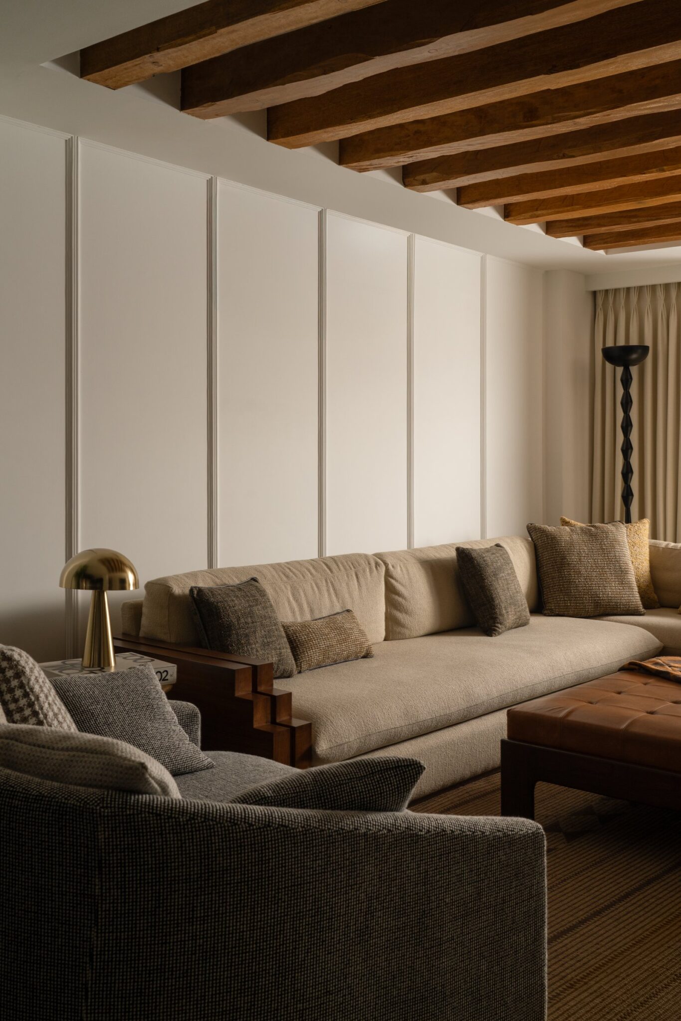
Deeper within the social spaces, the relationship between the dining area and the secondary living room reveals the home’s spatial intelligence. A floor to ceiling walnut shelving wall with softly rounded upper corners acts simultaneously as divider, display, and architectural anchor. Filled selectively with matte ceramic objects, books, and sculptural accents, it feels less like storage and more like a reflection of the family’s sensibility. Beyond it, the secondary sitting room unfolds in a softer, more introspective mood. Here, a deep olive toned sofa contrasts against warm beige seating, while textured plaster walls absorb light and create a quieter atmosphere. The walnut shelving reappears as a grounding element, its warmth balancing the cooler tones around it. Together, the spaces embody a home that values restraint, material honesty, and the confidence to let silence become part of the design language.


Across the main living room, the television wall shifts the material language into a more restrained and graphic expression. A slatted timber backdrop introduces texture and rhythm, while a blackened steel shelving system cuts through it with a lighter, almost floating presence. The open cantilevered shelves hold a carefully edited selection of sculptural objects, ceramic portrait busts, and abstract forms that feel less decorative and more architectural in intent. Beside it, a muted grey plaster wall allows the television to recede quietly into the composition rather than dominate it.
A pair of armchairs with matte black frames and cream linen upholstery subtly mirror the tonal balance established elsewhere in the apartment. Their understated form creates a visual dialogue with the handwoven rattan pendants above, reinforcing the continuity between softness and structure that defines the home. What emerges is a living space where furniture, objects, and material surfaces are treated not as separate layers, but as part of a singular architectural composition.

The kitchen and dining zone is where the apartment’s tonal confidence reaches its sharpest expression. The cabinetry in warm grey-beige runs floor to ceiling with quiet authority, and against it, the black granite worktop and splashback reads not as contrast but as grounding, the visual weight that keeps the pale cabinetry from floating. A matte black dome pendant hangs above the island, its mushroom silhouette and timber-wrapped stem sitting at the intersection of industrial form and organic material. The dining table’s dark stone top mirrors the kitchen surface, pulling the two zones into alignment, while the cane-back dining chairs in natural timber introduce the room’s single note of warmth.

The master bedroom introduces the apartment’s boldest material gesture through a full height exposed brick wall in deep terracotta red. Stretching behind the bed, the surface carries a raw warmth that transforms the atmosphere of the room entirely. Against the pale upholstered headboard and crisp white ceiling, the brick reads less as an applied feature and more as something elemental, grounding the space with texture and permanence.

From another angle, the bedroom reveals a second layer of craftsmanship through a timber panelled door inset with ribbed glass in a structured grid formation. The detailing feels timeless, drawing subtle references from colonial design language while remaining light through proportion and simplicity. Beside it, the black framed bed anchors the composition with quiet sharpness. The exposed brick softens into a background presence rather than a dominant statement, allowing the warmth of the room to emerge gradually and naturally rather than through overt expression.

A secondary bedroom adopts a lighter and more youthful sensibility while remaining equally refined in its execution. A sage green board and batten wall rises to mid height, introducing softness and structure in equal measure. Above it, two woven textile artworks in natural fibres and earthy brown tones are arranged as a quiet diptych, adding warmth without overwhelming the room’s calm palette. The layering of muted green against terracotta toned bed linen creates a subtle botanical character, while a woven rattan pendant gently entering the frame adds another tactile note to the composition.

Unlike the grounded intensity of the master suite, this room feels softer, airier, and more instinctive in mood. Yet the restraint remains consistent. Every texture, colour, and object feels carefully placed rather than styled for effect. The result is a bedroom that responds to its occupant with sensitivity and individuality, avoiding clichés while still feeling deeply personal and inviting.
The third bedroom embraces a softer and more relaxed interpretation of the apartment’s material language, where muted colour and tactile detailing create an atmosphere of quiet ease. A cane detailed bed frame in sage green introduces a subtle contrast against the otherwise neutral palette, while layered linens in warm beige and terracotta tones bring warmth without excess.
The wardrobe becomes the room’s defining architectural element, finished in pale tones with woven cane panel inserts that lend texture and lightness to the otherwise linear cabinetry. Slim black handles cut through the softness with precision, reinforcing the project’s recurring dialogue between natural materials and graphic detailing. Together, the room feels calm, tactile, and deeply liveable, carrying the same restraint and material sensitivity that defines the apartment as a whole.


The detailing within the bedroom extends seamlessly into the furniture selection, approached not as decoration but as a continuation of the apartment’s larger design language. A floating dressing table in matte black introduces a strong graphic presence, paired with a vertical mirror suspended from an elongated black steel rod. The composition feels sculptural in its restraint, carrying the clarity and confidence of an installation piece rather than conventional furniture.
A cane back chair in warm honey toned timber completes the setting, softening the sharpness of the black frame with an element of familiarity and craft. Together, the arrangement transforms an everyday ritual into a carefully composed moment, where even the most functional corner of the room is treated with the same level of thoughtfulness as the architecture itself.
The apartment reflects a more nuanced direction within Bangalore’s evolving residential design landscape. Rather than relying on the familiar shorthand of polished marble and international minimalism, Salmon Pink Studio builds warmth and identity through material memory and cultural specificity. Terracotta brick, carved timber, woven cane, and handcrafted objects are not applied motifs but integral parts of the architectural language itself. The apartment does not attempt to resolve the tension between rawness and refinement, restraint and expression. Instead, it allows these contrasts to coexist naturally, creating a home that feels lived in, evolving, and deeply human.