A children’s space succeeds or fails on a single question: does it treat the child as a participant or as an audience. The most considered ones operate on the first premise, building environments that invite agency rather than spectacle. Corals, the Children’s Club belongs firmly to that lineage, a 2,100-square-foot play landscape in Ahmedabad that proposes scale, colour, and architectural rhythm as tools of learning rather than decoration.
Designed by one/079 design studio under the direction of Aditi Patel, the project occupies a commercial shell whose exposed services have been embraced rather than concealed. The teal-painted ceiling, with its ductwork and red sprinkler runs left fully visible, sets the volumetric register of the space. Within this generous height, the studio has assembled a miniature town: zones for pretend play, build and construct, art and craft, sensory exploration, and active play, each marked by a coloured arch that doubles as both threshold and signage.
The first encounter is with an arched portal in coral, framing a glimpse into the Farmers Market beyond. The arch is not ornament; it is the project’s grammatical unit, a soft architectural cue that tells a child where one zone ends and another begins without resorting to walls or signage that talks down. Beside it, a cut-out window opens onto the dress-up nook, the kind of detail that lets a four-year-old understand the room before an adult has finished explaining it.

At the reception, the studio establishes its visual vocabulary in a single gesture. A rounded white desk, fronted with cut-out coral motifs in dusty pink, ochre, and burnt orange, sits against a plywood signage wall lit warmly from within.
The checkerboard floor in two tones of slate blue runs continuously beneath, a device that ties the entire 2,100 square feet into one navigable plane. It is also the rare children’s interior that does not announce itself with primary colours; the palette is muted, layered, and deliberately cinematic.

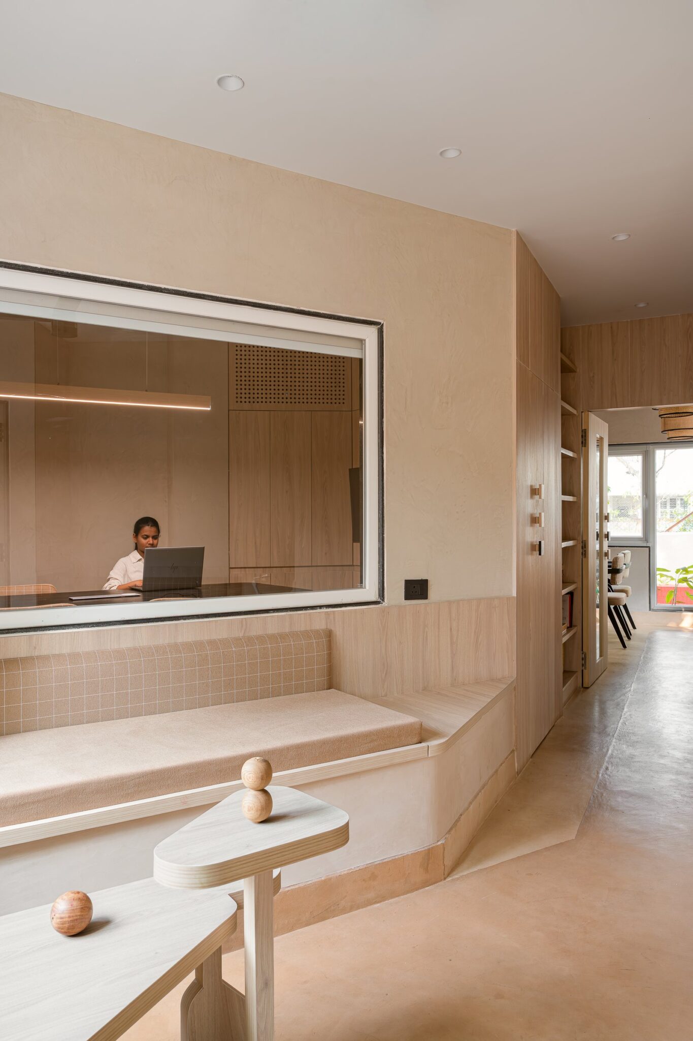
Just past the entry, a low cubby unit in mint green and terracotta receives the day’s bags and shoes. The proportions are exact for small hands and shorter sightlines, and the unit’s curved corners echo the language of the arches without imitating them.
A sculptural coral-leaf cut-out in dusty mauve marks the adjacent counter, the project’s namesake motif appearing here as a quiet signature rather than a literal illustration. Daylight from the floor-to-ceiling glazing bathes the corner; the room asks nothing of the child but presence.

The central commons opens dramatically. A curved plywood staircase with deep blue treads ascends toward the upper play volume, while a striped blue daybed runs along the opposite wall, offering caregivers a place to settle without retreating from the action. Suspended above, a constellation of circular acoustic baffles in coral, mustard, sky blue, and slate softens the noise of an open plan that would otherwise echo.
This is the single most considered move in the project. By keeping the ceiling exposed and then placing colour and absorption only where they are needed, the studio gets architectural drama and acoustic civility at the same time.

From the commons, sightlines run clean across the entire floor. Low plywood partitions with cut-out windows define the pretend-play zone without sealing it, allowing a parent at one table to see a child climbing at the far wall.
The yellow arch leading to the Build and Construct zone, flanked on either side by coral and pastel openings into the salon and veterinarian rooms, treats the play environment as a small civic block. Children move between professions, between identities, between scales of activity, on cues that are more theatrical than instructional.

The thresholds themselves deserve attention. Coral and ochre arches stand free of the partition walls behind them, like proscenium frames, with circular signage discs naming each zone in lowercase, child-legible type.
The cut-out window into Corals Town, with a superhero cape hanging inside, is the studio’s clearest statement of intent: the building gives the child a stage and a costume, then steps back. There is no instruction here on how to play.
““The arches act as subtle cues rather than rigid boundaries, encouraging exploration while giving each area its own identity.””

Inside Build and Construct, the architectural ambition becomes plain. Nested arches in mustard and coral sit within one another, framing a view into an adjacent activity zone and a smaller cut-out into an adjacent service area.
The construction tables are deliberately low and unfussy, leaving the architectural framing to do the visual work. A red balloon-dog sculpture perched on the partition is one of the rare moments of overt whimsy; everything else is restraint.
The mustard arch, viewed straight on, reveals how the studio thinks about thresholds as architectural events. It is full-height and flanked by low plywood partitions; the eye reads it as a doorway, marking the threshold to the Build & Construct zone.
This is a sophisticated move in a children’s interior, where most designers default to enclosure. Here, the openness preserves the volumetric drama of the original shell and lets light from the perimeter glazing reach every corner.

The pretend-play kitchen, marked Café, is the most fully realised of the role-play rooms. A buttery yellow back wall holds open shelving stacked with miniature crockery and a coral-arched pizza oven that mirrors, at toy scale, the architectural arches outside.
The detail is significant. The studio has carried its grammar all the way down to the props, so a child playing café is, without realising it, learning the same spatial language they have just walked through.

The Salon room takes the boldest colour decision in the project: a saturated coral wall striped with grey, with a single mint chair set in front of a child-height vanity. The room teaches by reduction. One activity, one mirror, one chair, and a clear surface for the props of pretend grooming.
Across the corridor, the Fire Station is rendered as a sculptural orange truck-form built into the architecture itself, complete with circular wheel cut-outs and a stepped rear platform. High-visibility jackets hang on hooks along the wall, ready to be pulled on.
The piece is not a toy placed in a room; it is the room. This is the studio’s most committed gesture toward immersive role-play, and it works because the architecture and the prop have been designed as one.

The Veterinarian corner is the project’s quietest room, and perhaps its most instructive. A two-tone wall in pale blue and warm cream, a small examination desk, a pale blue chair, and shelves stocked with stuffed patients.

After the saturated drama of the Fire Station, this restraint reads as deliberate pacing. The studio understands that a child’s day requires varied emotional registers, and the design provides them.
The Garage, with its checkerboard back wall and a sturdy blue toy jeep set on a low platform, completes the pretend-town circuit. Hi-vis vests and helmets hang within reach; orange traffic cones mark the play boundary. The room is unapologetic about its subject.

Returning to the sensory and art zones, the studio uses the perimeter glazing to let real daylight and real city views into the play environment. A curved teal-blue banquette wraps a corner, with low tables and small chairs in coral and teal scattered across the patterned floor.
The activity board on the wall, hand-lettered with the week’s exercises, is a reminder that this is a working space, not a showroom. The light is doing most of the design work in this room, and the studio has been wise enough to let it.
A wider view of the same zone captures the project’s spatial generosity. A child climbs the curved staircase toward the upper volume, while the activity board, the seating, and the cut-out window into the salon all coexist in a single sightline.
This is the supervisory logic the studio has built throughout: caregivers can see, children can roam, and the architecture mediates between the two without interrupting either.

The art and craft and active play zones share a soft pink arch, behind which a colourful climbing wall and a rope ladder establish the project’s gross-motor offering. Open plywood shelving holds finished artworks and supplies on the other side of the same arch.
The proximity of climbing and creating is intentional. A child can move between the two without leaving the room, and the design treats both as equally serious modes of play.

The toddler room carries a hand-painted Einstein quote, framed by two large coral-branch motifs that finally make the project’s name explicit. Beneath it, sensory boards line the lower wall at toddler height, and a sunken pale-blue play pit holds picture books at floor level.
““Play is the highest form of research.””

The same room, seen from another angle, shows how perimeter daylight and a single full-height window soften the entire environment. Mint cabinetry, low activity tables in cream and pink, and a navy daybed compose a room that is calm in its colour temperature even as it is busy in its programme.
An arched threshold in dusty pink frames a view into the art and reading area, where low plywood storage units hold trays and supplies and a pale blue tiled feature wall carries a scattering of small colored magnets. The cut-out vitrine on the right, set into the partition itself, doubles as a tiny library.
The detail captures everything the project does well. Architecture as cue, storage as display, and a sightline that always promises another room.
A child runs through the frame, slightly blurred. It is the truest image of the project: a building that is busy being used.
Within the small but expanding category of considered children’s environments in India, Corals positions itself thoughtfully. It does not borrow the bright primary palette of the international play-cafe template, nor does it retreat into the muted, parent-pleasing neutrals that have begun to dominate the same category. The coral-led palette, the consistent architectural grammar of the arch, and the restraint with overt motifs together suggest a studio working out a specifically considered visual language for the Indian play environment.
What distinguishes the project is the seriousness with which it treats its users. The arches, the sightlines, the acoustic baffles, the pretend-town civic structure: every decision assumes that a child is capable of reading architecture, navigating space, and choosing their own activity. The design does not perform childhood at them. It builds a small, coherent world and trusts them to inhabit it.